This week's thumbnail
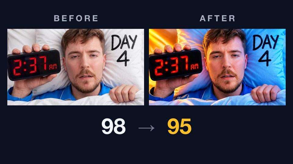
Last week's teardown took a strong thumbnail from 85 to 94 with one fix. This week the format broke down in the best possible way: the critique came back with almost nothing to fix.
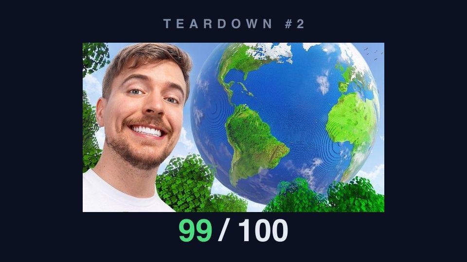
The subject: MrBeast Gaming's Minecraft Earth video, published August 29 and currently all over the gaming charts. It tours the Build the Earth project — tens of thousands of volunteers recreating the planet block by block, over a trillion blocks so far.
Let's get the obvious objection out of the way: this video would trend if the thumbnail were a potato. It's MrBeast. Nobody should read "trending video, high score" as proof of anything. But that's precisely what makes it a useful test — MrBeast runs the most deliberate, most A/B-tested packaging operation on YouTube. If our AI thumbnail critique is measuring what matters, it should be able to look at best-in-class work and independently reconstruct why it's best-in-class, dimension by dimension. So we handed it the image and the title it shipped with — "We Built the Earth in Minecraft!" — and let it grade.

What the critique found
It scored 99 overall — visual 100, title fit 93 — landing in the "Exceptional" band with high confidence. Nine of ten dimensions came back at the top level. That's the highest score this series has seen, and the sub-scores read like a packaging textbook.
There is no text, and the critique counted that as a strength. Under legibility: "The thumbnail has no text competing for limited space," and "at 168×94, the smiling face and block-built Earth remain immediately recognizable." That tiny size is a phone feed — the most common way anyone will ever see this image. Our text-legibility checks had literally nothing to inspect, and the score went up, not down.
Two beats, nothing else. Hierarchy: "The large face anchors the left side while the oversized Earth dominates the right." Every pixel belongs to one of two elements. There is no third thing asking for your eye.
Contrast does the separating. "The bright skin and blue globe separate clearly from the pale sky," with green land and dark tree blocks providing "strong color contrast across the image." No stroke, no glow, no outline — the palette itself keeps the subjects off the background.
The image asks the question. Curiosity: "The giant spherical Earth in Minecraft creates an unusual visual question about how it was built." And distinctiveness: "The combination of a creator portrait and a full Minecraft Earth globe is highly specific" — you will not mistake this tile for any other video in the feed.
The title and image split the work. Title complementarity: "The visual directly reinforces the title by showing a Minecraft Earth rather than repeating words on the image." The title makes the claim; the thumbnail shows the evidence. Neither wastes space doing the other's job.
The one point it docked
Even at 99, the critique found a seam. Promise consistency came back one level down: "The image shows the finished Earth but does not show the building process mentioned by the title."
The title said "We Built the Earth" — a process. The image shows a completed planet — a result. It's a small mismatch, and the critique treated it that way, attaching a single low-priority action: align the implied promise with the stated content, so that "clicks come from viewers who want this video."
That's the whole punch list. One low-priority note.
Then MrBeast's team fixed it
Here's where it gets fun. The critique above was run against the title the video shipped with. Check the video today and it's called something else: "World's Largest Minecraft Build!"
MrBeast is famous for repackaging videos after upload — titles and thumbnails get swapped until the numbers say stop. We can't know their reasoning, and we're certainly not claiming they read our report. But look at the direction of the change: "We Built the Earth" promised a building process the image doesn't show. "World's Largest Minecraft Build" promises a spectacle — which is exactly what the image shows. The one gap our critique flagged is the gap the retitle closed.
The thumbnail didn't change, and didn't need to. When your image and your title promise different things, you fix whichever is cheaper — and a title is a text field.
What a 99 means
A critique score measures packaging craft, not destiny. MrBeast's views come from MrBeast. What this teardown shows is narrower and more useful: when the most optimized packaging operation on YouTube ships a thumbnail, our rubric doesn't just nod along — it can name each individual decision that makes the image work, and the one place where even this team left a click on the table was the one place their own post-upload behavior went on to touch. The scale is calibrated at the top. Last week's 85 and this week's 99 are measuring the same things.
Three things to steal
- No text is a decision, not an absence. This thumbnail wins legibility because it's empty of words — the title sits right next to it in the feed and carries the claim. Before you add a caption, ask what it says that the face, the object, or the title doesn't.
- Budget for two beats. A face to feel with and an object to wonder about. Every additional element would have taxed both. If your thumbnail has five things in it, it has three too many.
- Match the promise — after upload, too. Packaging isn't done when you publish. If the image shows a result and the title sells a process (or vice versa), viewers feel the wobble even if they can't name it. Fix the cheaper half. MrBeast changed the title.
Run your own teardown
The flow from this series is free to try with a Google sign-in: drop your thumbnail into ThumbnailPeak, run a critique, then apply the suggested fixes with AI Improve and compare results side by side. If there's a famous thumbnail you want torn down in a future entry, we're listening.
Thumbnail imagery belongs to its creator and is shown here for commentary and education. This teardown analyzes packaging only — and to be perfectly clear, no one needs our help selling a trillion-block Earth. That the score agrees is rather the point.