Disclosure: we make ThumbnailPeak, and this post tests its critique. Every score below is what it returned on 22 October 2026, on our own account. The photo is DashingHeights', published under a Creative Commons licence; the words on it are ours.
Most lists of the best thumbnail fonts show each font at full size, on a white page. Nobody sees a thumbnail that way. On a phone's channel page it's 160 pixels wide, and in the playlist panel beside a video it's 100.
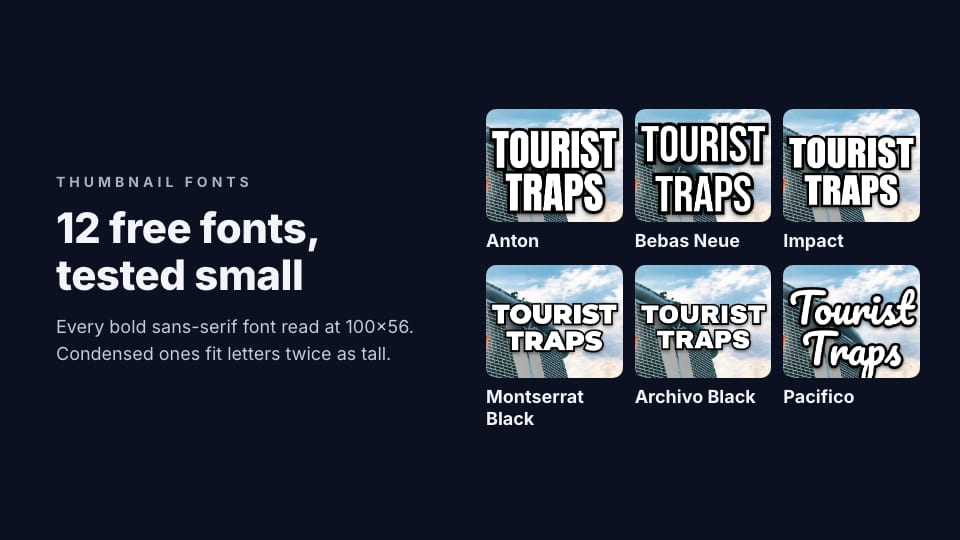
So we tested fonts at those sizes. We set the same two words, "TOURIST TRAPS", in 12 popular free fonts, in the same space on the same thumbnail, and checked what was left when we shrank each one. Here's what we found:
- Every bold sans-serif font could still be read. A machine text reader got all ten right at 160×90, and again at 100×56.
- The real difference was size. In the same space, condensed fonts fit much taller letters. At 160×90, Anton's capitals were 15.5 pixels tall and Archivo Black's 7.3: twice the height, from the same space.
- The script and serif fonts failed first. The reader got Pacifico wrong at 160×90 and Playfair Display wrong at 100×56.
- Our critique scored all 12 between 80 and 97. The two lowest were the widest font, Archivo Black, and the serif, Playfair Display. But scores move by about 5 points between runs, so most of the fonts were effectively tied.
The test
We started from DashingHeights' thumbnail for "8 BIGGEST Tourist Traps in Singapore", with its own words removed using ThumbnailPeak's Edit: the creator holding up a hand in front of Marina Bay Sands, with open sky on the right.
In that space, a box 420 pixels wide and 560 tall on the 1280×720 thumbnail, we set "TOURIST" over "TRAPS" in each font. Every version got the same treatment: white letters, a black outline and a soft shadow, as large as would fit the box. Pacifico, a script font, was set as "Tourist Traps", the way script fonts are used; the others in capitals.
The 12 fonts are ones that turn up again and again in thumbnail font lists, plus a serif and a script for comparison. All are free: 11 come from Google Fonts, and Impact comes with Windows and macOS.
For each version, we measured the height of its capital letters, shrank it to 160×90 and 100×56 and asked Apple's on-device text recognition to read it back, and ran it through ThumbnailPeak's AI critique with the video's real title.
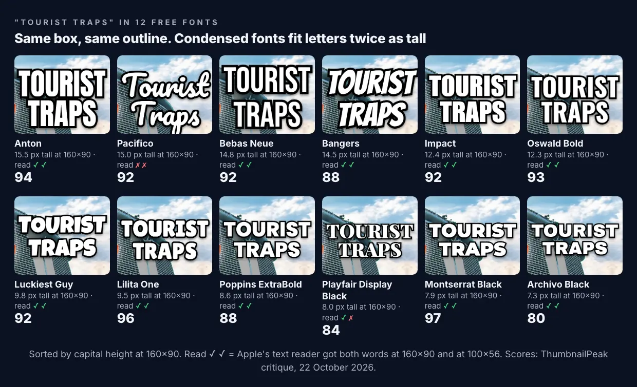
Condensed fonts fit letters twice as tall
The box was the same for every font. What changed was how much of it the letters could use.
A wide font like Archivo Black or Montserrat Black runs out of width first: "TOURIST" fills 420 pixels before the letters get tall. A condensed font like Anton or Bebas Neue packs the same word into less width, so it can grow until it runs out of height instead. At 160×90:
- Anton: 15.5 pixels tall
- Bebas Neue: 14.8
- Bangers: 14.5
- Impact: 12.4
- Oswald Bold: 12.3
- Luckiest Guy: 9.8
- Lilita One: 9.5
- Poppins ExtraBold: 8.6
- Montserrat Black: 7.9
- Archivo Black: 7.3
That's the whole case for the classic thumbnail fonts. Impact, Anton and Bebas Neue aren't popular because they're beautiful. They're popular because they let the same words be bigger, and on a 160-pixel thumbnail, bigger is what reads.
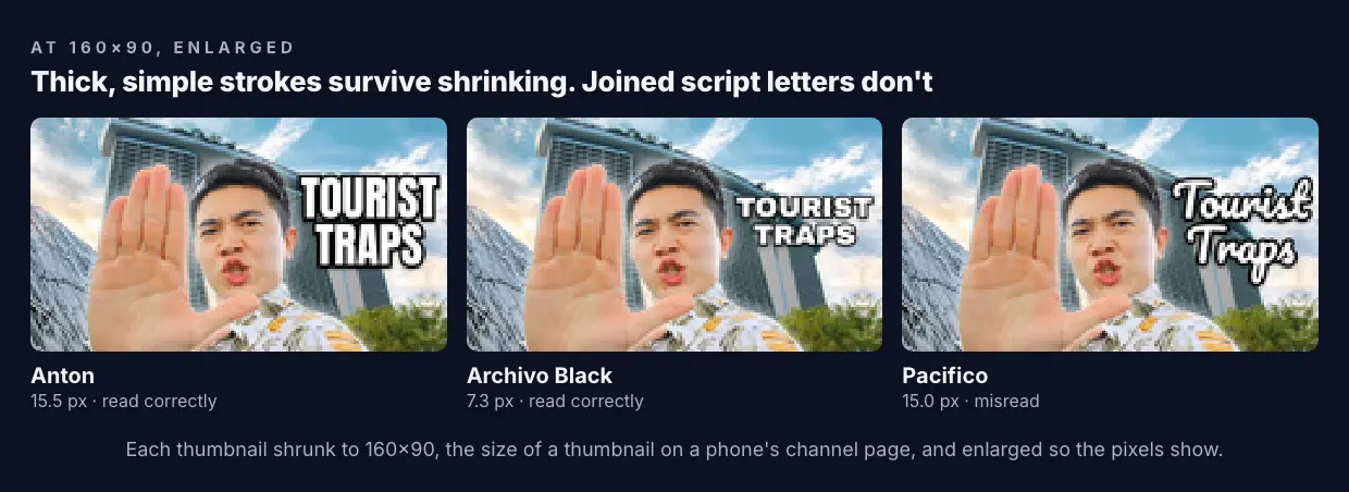
The script and serif fonts failed first
Pacifico's letters were tall: 15 pixels at 160×90, nearly as tall as Anton's. It still failed. The text reader read it as nonsense at 160×90. Script letters join up, and their thin connecting strokes vanish when the picture shrinks, so the word stops looking like letters.
Playfair Display Black, a serif font, survived 160×90 but not 100×56, where the reader made "TITE" of it. Its thin strokes and serifs are lovely at full size and are the first thing to go at small sizes.
Every bold sans-serif font, the ten without serifs or joined letters, read correctly at both sizes, even Archivo Black at 7.3 pixels. A thick, simple stroke survives shrinking. A text reader isn't a person, but it fails where thin strokes blur together, and so do eyes.
What the critique said
ThumbnailPeak's critique checks whether every word can be read at 168×94. It scored the 12 versions between 80 and 97:
- Highest: Montserrat Black 97, Lilita One 96, Anton 94, Oswald 93.
- Lowest: Archivo Black 80 and Playfair Display 84, both marked down to 3 out of 4 for legibility.
The two lowest match the measurements: Archivo Black had the smallest letters of all, and Playfair was the font with thin strokes. But don't read too much into the rest. Bangers had big letters and was also marked down for legibility, and Montserrat Black, with small letters, scored highest. Scores move by up to about 5 points between runs, so a font at 92 and one at 96 are tied.
What the critique didn't do is fail any of them outright. With two words, a thick outline and a clear background, every font passed. Fonts matter most when a thumbnail is already pushing its luck: more words, less space, a busy background.
On ThumbnailPeak, legibility is the check creators lose the most points on. Of 4,925 thumbnails critiqued from 15 August to 22 October 2026, only 40% got the top grade for legibility, and 14% got a fix to make their words bigger. Only 3% got a fix for the contrast of their words. When words don't read, it's usually because they're too small, not because of their colour.
The best fonts for YouTube thumbnails, by job
There's no single best font. There's a best font for what your words need to do.
When the words are long or the space is tight: Anton, Bebas Neue, Oswald Bold or Impact. They're condensed, so they give you the tallest letters for the space. Bebas Neue has no lower-case letters, so it's capitals only.
For a loud, playful channel: Bangers, Luckiest Guy or Lilita One. Bangers is condensed and slanted like a comic book, so it's both playful and space-efficient. Luckiest Guy and Lilita One are rounder and wider, so give them short words.
For a clean, modern look with short words: Montserrat Black, Poppins ExtraBold or Archivo Black. They're wide and heavy. Use them for one to three short words, not a full sentence.
Not for the headline: script fonts like Pacifico and thin serifs like Playfair Display. Use them for a small accent word next to a bold headline, if at all.
The rest is outline and size
The font is one choice of several, and not the biggest:
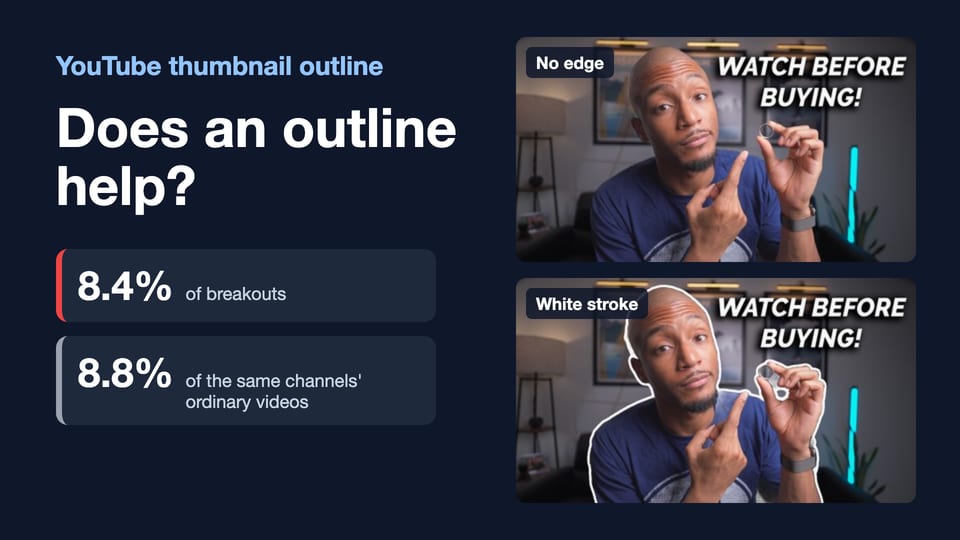
- Outline or shadow the words. Every version in our test had a black outline, which is why even the smallest stayed readable over a building and sky. Without one, white letters over a busy picture blur into it.
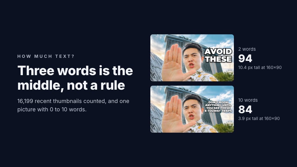
- Make one line big. On the 16,199 recent thumbnails we counted for our post on how much text a thumbnail needs, the biggest line of text was usually about a fifth of the picture's height.
- Use one font, two at most. One for the headline, maybe a second for a small accent. More than that looks like a ransom note at any size.
- Keep it the same across your videos. A font your viewers recognise is part of your channel's look. Our guide to thumbnail branding covers how much to keep the same.
- Check it small. ThumbnailPeak's thumbnail tester shows your thumbnail on a phone, a computer and a TV, free, and the critique checks whether every word reads at 168×94.
Where to get these fonts
Eleven of the twelve are free on Google Fonts: Anton, Bebas Neue, Oswald, Montserrat, Poppins, Archivo Black, Bangers, Lilita One, Playfair Display and Pacifico are under the SIL Open Font License, and Luckiest Guy under the Apache License. Both let you use the fonts commercially, which includes thumbnails for a monetised channel. Impact comes with Windows and macOS. Most of them are also built into online design tools such as Canva.
Frequently asked questions
What is the best font for YouTube thumbnails?
A bold, condensed sans-serif such as Anton, Bebas Neue or Impact, if your words are long or your space is tight, because it fits the tallest letters into the space. For one or two short words, a heavy wide font like Montserrat Black works just as well.
What size should the text on a YouTube thumbnail be?
As big as the space allows, with the main line around a fifth of the picture's height: about 130 pixels on a 1280×720 thumbnail. In our tests, capitals about 7 pixels tall at 160×90 could still be read; under 5 pixels, they couldn't.
Is Impact a good font for thumbnails?
Yes. It's condensed and heavy, so it fits tall letters into a small space. In our test, its capitals came out 12.4 pixels tall at 160×90, among the tallest, and read correctly at every size. It comes with Windows and macOS.
Are Google Fonts free to use in YouTube thumbnails?
Yes. Fonts on Google Fonts are under open licences, such as the SIL Open Font License, that allow commercial use, including in thumbnails for a monetised channel.
How we did it: the thumbnail is DashingHeights' "8 BIGGEST Tourist Traps in Singapore", published under CC BY 3.0; we removed its words and icons with ThumbnailPeak's Edit and set our own. DashingHeights did not make or approve these versions. Each font was set in white with a black outline at the largest size that fit a 420×560-pixel box on the 1280×720 thumbnail, in Google Chrome. Letter heights are the measured height of a capital H, scaled to 160×90. Each version was shrunk with Lanczos resampling, then read with Apple's Vision text recognition on our own computer; "read" means it returned both words exactly. Each version was critiqued once with the video's title on 22 October 2026. The ThumbnailPeak counts cover thumbnails critiqued from 15 August to 22 October 2026, each picture once, with our own account's critiques left out.