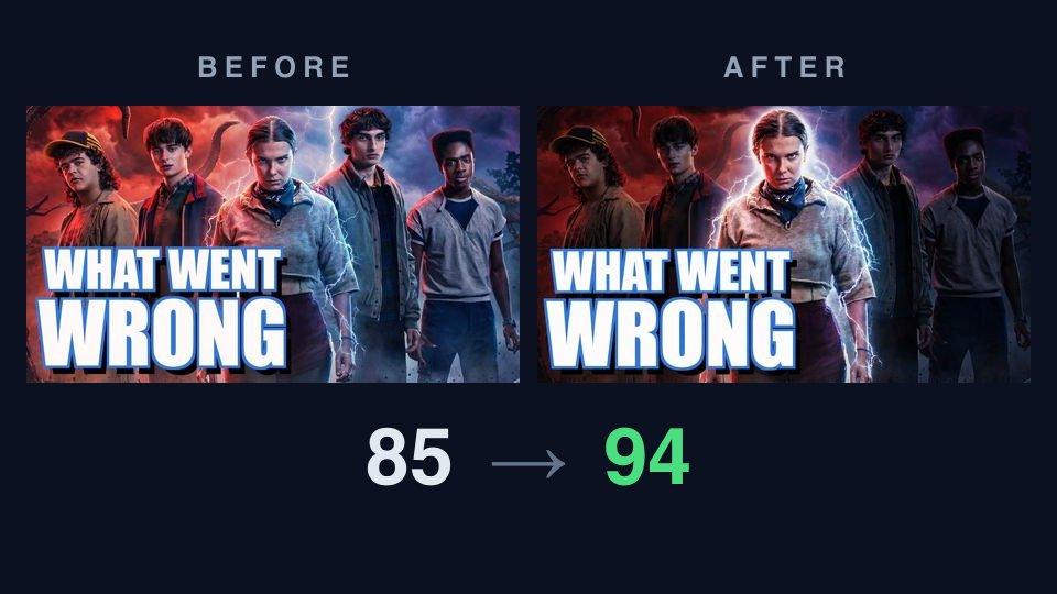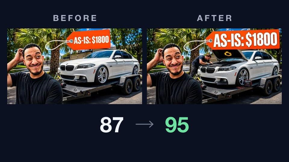
This week's thumbnail
Teardown #1 took a strong thumbnail from 85 to 94 with a single relighting fix. Teardown #2 handed the critique a near-perfect MrBeast thumbnail to see whether the rubric could explain a 99. This week is the case both of those skipped: a thumbnail that is already winning, on a video that is already an outlier, that still had eight points sitting on the table.
The subject: Vehicle Virals' "I Bought a DEAD Twin-Turbo V8 BMW for $1,800… We Found the Problem in 5 Minutes". At the time of writing it's six days old with roughly 266,000 views, on a 445,000-subscriber channel whose videos typically land around 18,000. That's a breakout by any measure — about fifteen times the channel's own baseline. Nobody would look at this and think the packaging needed work.
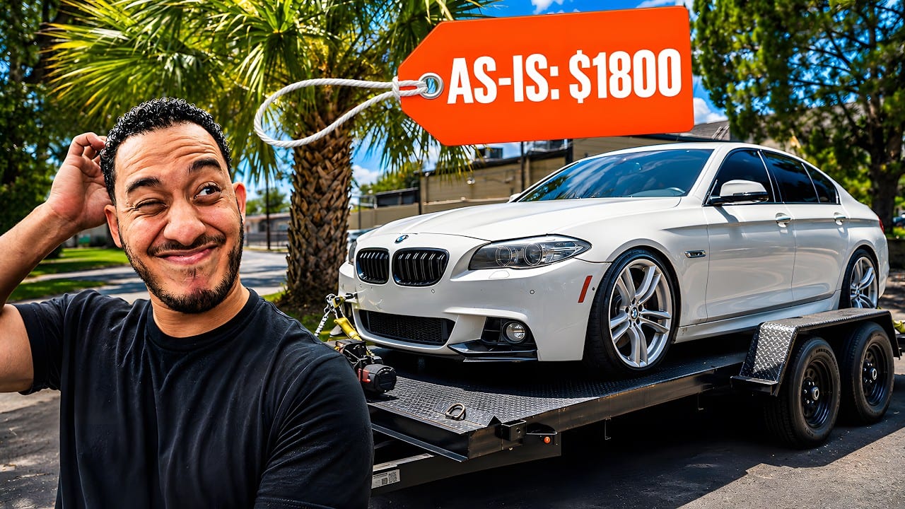
The craft is obvious. A big reaction face in the left third, a clean white BMW strapped to a flatbed, palm trees and blue sky, and an orange price tag dangling on a cable like something off a dealership windshield. So what does the critique make of it?
Before: what the critique found
It scored 87 overall — visual 88, title fit 80 — landing in the "Strong" band with high confidence. That title-fit number is the tell: the picture is doing better work than the picture-plus-title pairing is.
What it praised:
- Hierarchy: "The face, white BMW, and orange price tag create three clear focal points without competing background elements."
- Contrast: "The white text stands out strongly against the orange tag, and the white car separates clearly from the darker trailer and street."
- Subject clarity: "The man, BMW, and trailer are immediately recognizable at feed size." Feed size is 168×94 — roughly a thumbnail on a phone, and the only size that really matters.
- Topic match: "The thumbnail clearly shows a BMW on a trailer and the $1,800 purchase price from the title."
Where it docked points:
- Legibility came in a level down: "The white 'AS-IS: $1800' text remains readable in the 168×94 version, but the tag and lettering are small."
- Trust and polish: "The image is sharp, bright, and professionally composed, but the pristine BMW does not visibly communicate that it is dead or faulty."
- Promise consistency was the weakest dimension on the board, two levels down: "The trailer suggests the BMW may not run, but the clean car and smiling reaction do not show the dead-engine or problem-solving part of the title."
There's the whole diagnosis in one line. The title makes two promises — the car is dead, and we found the problem in five minutes. The image delivers neither. It shows a car being bought. Every visible pixel of that BMW is immaculate.
The two fixes it recommended
The critique returned a two-item punch list, and the priorities are worth reading as much as the items:
High — strengthen the value promise. Target: the BMW and trailer area. "The car looks clean, but no visible detail shows why it was bought as a dead vehicle." Add a clear engine-bay fault cue, warning light, jump pack, or mechanic inspecting the BMW. Expected effect: "Make the dead-car problem visible and give viewers a stronger reason to learn what went wrong."
Medium — increase the text size. Target: the orange "AS-IS: $1800" tag. "The wording is readable at 168×94, but it occupies a small area and loses detail at feed size." Enlarge the tag lettering slightly while keeping the full price and "AS-IS" wording.
Note what's not on the list: nothing about the face, the framing, the color, or the location. The critique isn't asking for a different thumbnail. It found the one thing the image fails to say, and one thing it says too quietly.
After: one click of Improve
We handed the critique to AI Improve and let it apply both. Here's what came back:
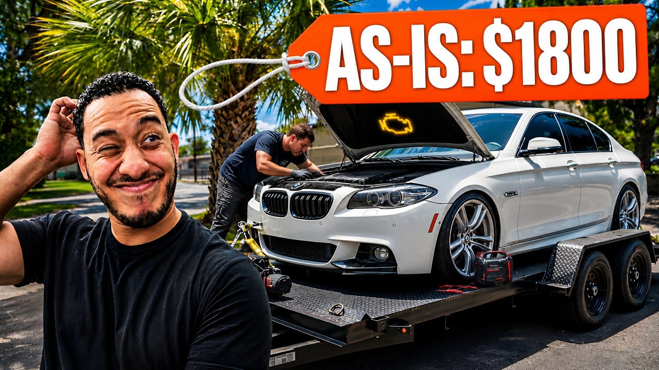
The high-priority action offered four ways to make the fault visible — "engine-bay fault cue, warning light, jump pack, or mechanic." Improve didn't pick one. It shipped all four: the hood is up, a mechanic is bent into the engine bay, a yellow check-engine symbol glows over the open hood, and a jump pack sits on the trailer deck by the front wheel. (Improve has since changed: when a suggestion offers options, it now applies only the first.) Same car, same guy, same trailer, same afternoon — but the story moved forward by one scene. And the swing tag stopped swinging: it's now a wide banner across the top with much larger lettering and a heavy black shadow.
Re-critiqued from scratch, the variant scored 95 overall — visual 96, title fit 88 — moving from "Strong" to "Exceptional." Three dimensions climbed, and they're exactly the three the actions targeted:
- Legibility (up one): "The thick black shadow keeps every character distinct from the red tag."
- Curiosity (up one): "The dead-looking BMW, glowing check-engine symbol, and $1,800 price create a clear problem-and-price question. The man's exaggerated reaction adds urgency without hiding the car."
- Promise consistency (up one): "The broken-car setup supports 'DEAD' and the visible mechanic supports finding a problem."
Title fit jumped eight points on its own. The image finally corroborates the sentence next to it.
The head-to-head
Scoring two images separately is one thing; we also ran them through a direct comparison, where the model judges them side by side the way a viewer meets them — as neighbors in a feed. The verdict: the variant wins, and unlike teardown #1's "slight" margin, this one is called clear.
Verbatim: "B is the stronger click choice. At 168×94, its large 'AS-IS: $1800' tag remains easy to read, while the open hood, mechanic, glowing engine warning, and jumper pack immediately show that the BMW has a problem. A is cleaner, but mostly shows a car on a trailer and a reaction face, so it gives less reason to investigate."
And it was honest about what the original does better. Under "clean composition," the win goes to the original: "A leaves more of the BMW unobstructed and has fewer competing details. B's large tag covers part of the roof, though the added repair clues are more valuable here." That's the real trade. The variant is a busier image. It gave up some of that showroom cleanliness to buy a reason to click, and at feed size the comparison says the trade is worth making.
Even at 95, the punch list isn't empty. The remaining note is one we've now seen in all three teardowns: stop repeating the title. "The thumbnail repeats the title's $1,800 detail without adding a new promise." Its suggestion is to replace the price text with a problem-focused phrase — its example, "WHAT FAILED?" — so the tile asks a question the title hasn't already answered. The title already says $1,800. There is always a next move.
Three things to steal
- Show the payoff, not the purchase. The most common promise gap in this genre isn't a bad image, it's an image set one scene too early. If your title promises a discovery, a disaster, or a fix, the thumbnail should be at the moment around it — not at the moment you pulled into the driveway.
- When you get a list of options, consider shipping all of them. The critique offered four ways to make the fault visible and any one would have moved the score. Together they cost almost no extra visual real estate, because they all live in the same place — the engine bay that was already in frame.
- A tag that dangles is a tag that shrinks. The original's price tag was a lovely piece of art direction at full size and a small orange smudge at 168×94. Design the element at the size people actually see it, then decide whether the styling survives.
Run your own teardown
Everything in this post is free to try with a Google sign-in: drop your thumbnail into ThumbnailPeak, run a critique, apply the suggested fixes with AI Improve, and put the two side by side. If there's a thumbnail you want torn down in a future entry, we're listening.
Thumbnail imagery belongs to its creator and is shown here for commentary and education. This teardown analyzes packaging only. The video did fifteen times its channel's typical views with the original image, which is the point worth sitting with: "already working" and "nothing left to gain" are not the same sentence.