
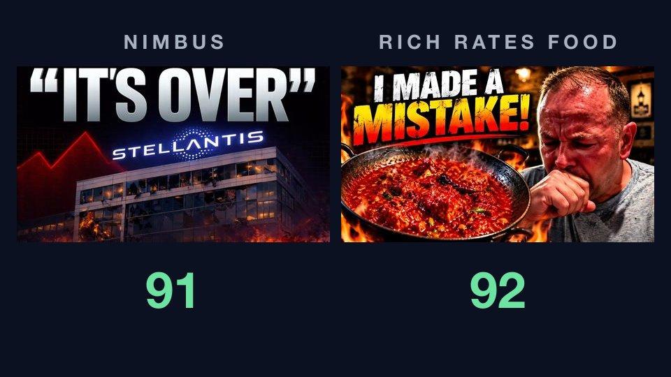
This week's thumbnails
If you have ever posted "rate my thumbnail" in a creator Discord, you know what comes back: a number, or a thumbs-up, and very little you can act on. This week's teardown is about the gap between a thumbnail rating and a thumbnail critique, and two breakout videos make that gap hard to miss.
Both came off the Entertainment board of Breakouts, which ranks the past week's videos by how far each beat its own channel's typical views. When the board was refreshed on October 8, these two sat near the top:
- Nimbus, "Stellantis Is Losing Everything: Jeep, Dodge & Fiat on the Brink", published October 3. By October 11 it had about 2.8 million views, on a channel of about 10,800 subscribers. Of the channel's twelve most recent uploads, seven landed between 1,000 and 10,000 views and four between 173,000 and 608,000. This one is more than four times the biggest of those. Breakouts put it at 588 times the channel's typical views.
- Rich Rates Food, "I Tried a Curry HOTTER Than a Phaal... This Was Insane!🌶️", published October 2. By October 11 it had 562,000 views, on a channel of about 11,300 subscribers whose restaurant reviews usually draw 3,000 to 16,000. Of its sixteen most recent uploads, the three biggest are all about chilli heat: a Pepper X pizza at 67,000 views, a secret off-menu phaal at 128,000, and this one. Breakouts put it at 52 times typical.
One is a faceless business explainer and the other an on-camera food challenge. We gave our AI thumbnail critique each image and the title it shipped with, nothing else, and ran it once on each. They came back one point apart: 91 and 92, both in the top band, both at high confidence. If a rating were all you got, you would call them equally finished. The critiques say otherwise.
Most earlier entries in this series went on to fix the thumbnail with AI Improve and put the two versions head to head. This one stops at the critique, because the critique is the point.
Nimbus: 91, and a fire the critique wants put out
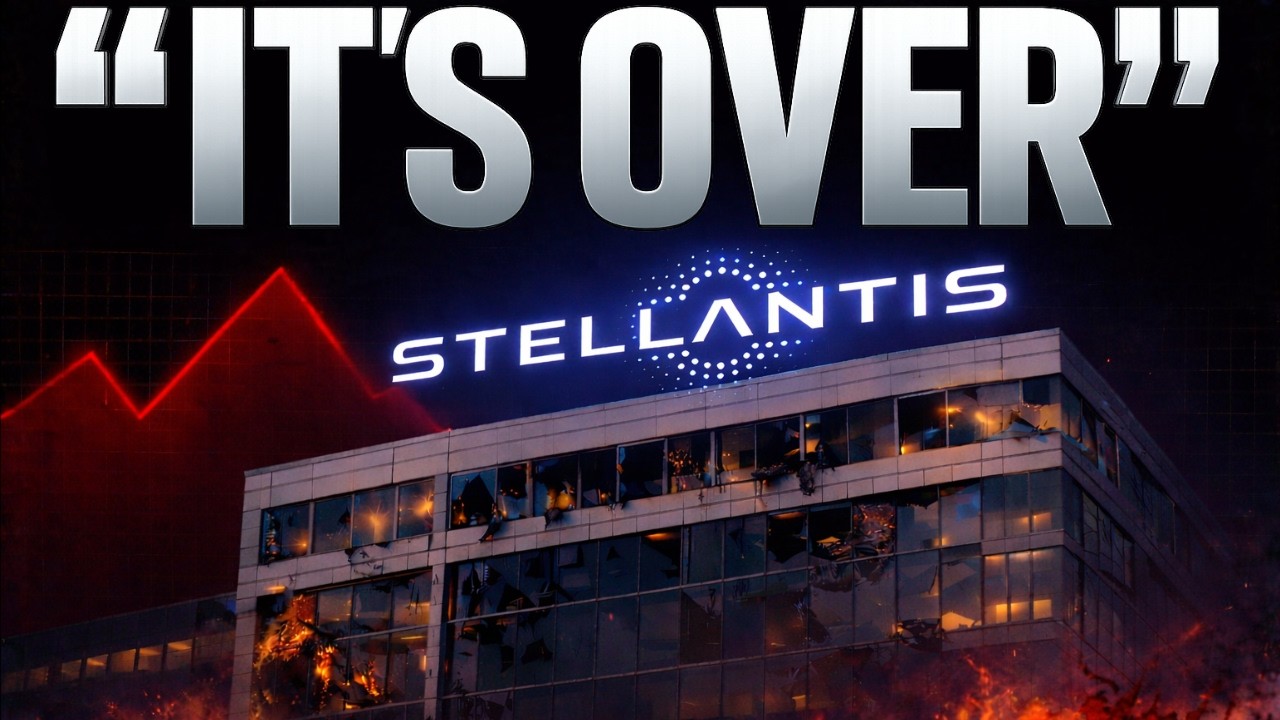
Nimbus's thumbnail is the corporate-collapse template done well: "IT'S OVER" in giant quotes across the top, the Stellantis logo glowing on an office block, a red line chart peaking and dropping behind it, and flames and blown-out windows along the bottom.
It scored 91 overall: visual 91, title fit 88, "Exceptional," high confidence.
The headline does its job. Legibility came back at the top level: "The white “IT’S OVER” headline remains clearly readable in the 168×94 version." So did hierarchy: "The oversized headline dominates first, followed by the Stellantis logo and damaged building." And curiosity: "The absolute “IT’S OVER” claim paired with a burning, damaged office building creates an immediate crisis question."
Then the critique turns to the fire. Trust & polish came back at 2, the lowest grade on either thumbnail: "The destroyed-looking building and flames make the thumbnail feel highly dramatized for a corporate news topic," and "The giant absolute headline leaves little room for a specific, credible claim." The same flames cost a level of subject clarity, because the building's "lower half blends into the fire and dark foreground," and a level of distinctiveness: "The burning-building, falling-chart treatment is common in corporate-collapse thumbnails."
It also notices the thumbnail says more than the title. Promise consistency: "The thumbnail presents a more final and extreme outcome than the title's wording." The title says "on the brink." The thumbnail says it's over.
The fix list leads with the fire, at high priority: remove the misleading element. "The effects make the company look physically destroyed, while the title describes a business crisis." Replace the disaster effects "with a falling stock chart, declining sales graphic, or subdued damaged-building treatment." The expected effect is that it "makes the visual support the financial claim more honestly and improves credibility."
The second fix, at medium priority, is to differentiate from the genre norm: replace one generic effect "with a specific visual cue for the named brands, such as small Jeep, Dodge, and Fiat identifiers or a relevant vehicle lineup." That lines up with the last grade it docked, title complementarity: "It does not visually distinguish the Jeep, Dodge, or Fiat brands named in the title."
The video's own description backs the critique's reading. The story is about money: a company that "reported a €22.3 billion loss, the biggest in its history, with around €70 billion in market value wiped out." And it ends on a turn rather than an ending: "And now, his successor is undoing almost everything he did." A loss that size is a crisis, and a new CEO reversing course is a story that is still going. Neither is a building on fire, and neither is quite "over."
The obvious objection: 2.8 million people clicked it. They did, and the fire may well be part of why. A critique is not a view forecast. It grades the packaging against the video it sells, and what it is telling Nimbus is narrower than "this is bad": the most dramatic part of the thumbnail is also the part that promises something the video doesn't show. Some creators will keep that trade on purpose. The critique's job is to make sure it is a choice and not an accident.
Rich Rates Food: 92, and one small note
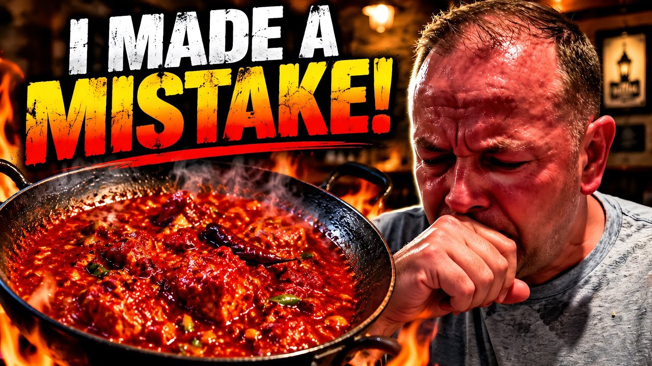
Rich Rates Food's thumbnail is the spicy-food template: "I MADE A MISTAKE!" in rough-edged white and yellow capitals, a pan of red curry with flames licking up around it, and Rich on the right, eyes shut, face flushed, fist pressed to mouth.
It scored 92 overall: visual 91, title fit 95, "Exceptional," high confidence.
The subject is unmistakable. Subject clarity: "The sweating man's pained reaction and the steaming red curry clearly communicate an extremely hot meal." Hierarchy: "The large headline, man's face, and fiery curry pan create a clear reading order." Curiosity: "The phrase 'I MADE A MISTAKE!' paired with the man's distress creates a clear unanswered question about what went wrong."
The promise is kept. Promise consistency came back at the top level, where Nimbus's did not: "The shut eyes, flushed skin, hand over mouth, steam, and red curry support the title's claim of an extreme reaction."
It lost a level on the lettering. Legibility: "The white and yellow headline remains readable at 168×94, though the distressed texture breaks up parts of the letters." That is the one picture dimension where Nimbus came out ahead. You can see why at the size most people meet these thumbnails:
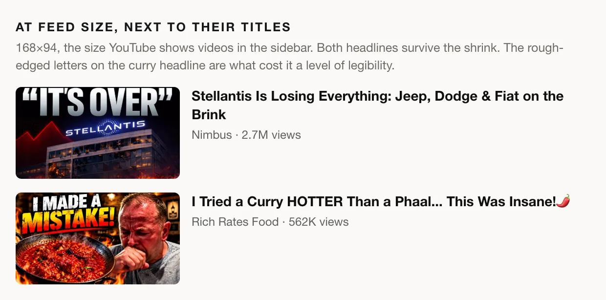
Both headlines survive the shrink. Nimbus's clean silver letters stay crisp; the rough edges on "MISTAKE!" start to break up.
It got the same genre notes Nimbus did, only milder. Distinctiveness at 3: "the reaction-food format is common in spicy-food thumbnails." Trust & polish at 3: "the oversized distressed headline and heavy fire effects feel highly sensationalized." Title complementarity at 3: "The thumbnail does not visually communicate the specific comparison to a phaal."
The whole fix list is one low-priority note, to differentiate from the genre norm: "Add one specific visual identifier, such as a clearly visible phaal label or a comparison arrow between the curry and a phaal dish."
Why the same flames cost less here. The critique calls the fire on Rich's pan "heavy fire effects," so it is no more real than the fire on Nimbus's building. The difference is what it exaggerates. From the video's description: "The heat hit immediately — hiccups, sweating and eventually the realisation that I may have made a massive mistake!" The headline is the video's own line. Rich's thumbnail turns up the volume on something that happens in the video; Nimbus's shows something that doesn't. The critique graded them that way: promise consistency 4 against 3, trust & polish 3 against 2.
Same rating, different routes
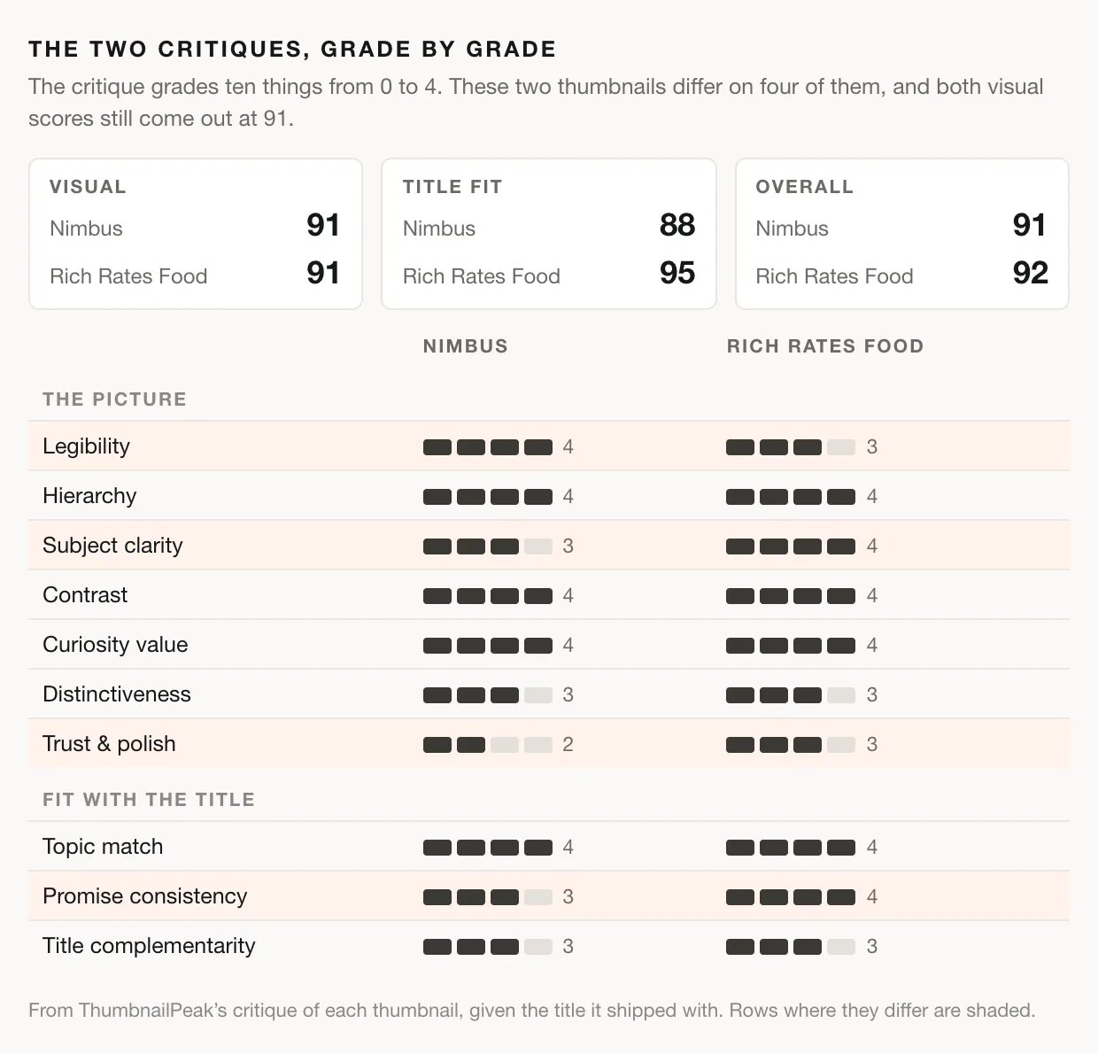
Put the two critiques side by side and the ratings stop looking alike. Both visual scores are 91, reached by different routes: Nimbus's headline is cleaner (legibility 4 to 3), while Rich's subject is clearer and more credible (subject clarity 4 to 3, trust & polish 3 to 2). On fit, Rich's thumbnail keeps its promise (4 to 3) and wins 95 to 88. That seven-point fit gap moves the overall rating by one point, because the overall rating is mostly about the picture.
Then the fix lists. One critique opens with a high-priority correction, and the other has a single low-priority suggestion. The ratings are one point apart, and the next steps are nowhere near each other.
How the thumbnail rating is calculated
Every critique is three independent AI passes over the same image. Each pass grades seven things about the picture: legibility, hierarchy, subject clarity, contrast, curiosity value, distinctiveness, and trust & polish. When you give it a title, each pass also grades three things about how the image fits that title: topic match, promise consistency and title complementarity. Each grade runs from 0 to 4, and legibility is judged at 168×94, the size YouTube shows in the sidebar.
Code, not the AI, turns those grades into numbers. Each dimension's grade is the median of the three passes. The visual score weights the seven picture grades, with legibility and hierarchy counting most and trust & polish least, and the title-fit score does the same for the other three. The overall rating is mostly the visual score, with fit nudging it. Then comes a band: Exceptional from 90, Strong from 75, Solid from 60, Developing from 40, and Weak below that.
Confidence is how closely the three passes agreed. "High" means no dimension's three grades were more than one level apart. Both of these came back high. The passes agreed outright on every dimension except subject clarity for Nimbus, and promise consistency and title complementarity for Rich Rates Food, and they were one level apart on those.
Separately from the score, the critique picks up to three fixes and ranks them. The priority label (high, medium or low) says how serious the passes judged the problem, not how many points fixing it would add.
That last sentence explains this week. Trust & polish carries the smallest weight of the seven picture dimensions, so Nimbus's grade of 2 there cost its rating only a couple of points. A rating alone would have buried the problem. The fix list put it first.
Three things to steal
- Say the consequence, not the title. "IT'S OVER" and "I MADE A MISTAKE!" both turn the title into a reaction instead of repeating it, and both got top marks for curiosity. Earlier entries in this series kept coming back to "stop repeating the title." These two already don't.
- Then add the one specific your title names. Both critiques docked distinctiveness and title complementarity for the same missing thing: Jeep, Dodge and Fiat on one, the phaal on the other. Both asked for one identifier. The template tells viewers the genre, and the specific tells them which video this is.
- Exaggerate what's true. Flames on a curry that really did hurt got promise consistency 4 and trust & polish 3. Flames on a building that isn't burning got 3 and 2, and the top of the fix list. Turn up what happens in your video, not what doesn't.
Rate your own thumbnail
Run a thumbnail critique on yours. Upload the image, add the title, and you get the rating, all ten grades with the evidence behind each one, and up to three fixes in priority order. It's free with an account. Read the fixes before the number. Both full reports from this post are public: Nimbus and Rich Rates Food.
If you're looking for thumbnails worth studying, these two came from the Categories tab of Breakouts. It's free and needs no account.
Thumbnail imagery belongs to its creators and is shown here for commentary and education. This teardown analyzes packaging only. Both videos earned their views, and nothing here takes that away. The critique only says what each thumbnail promises, and how well it keeps that promise.