
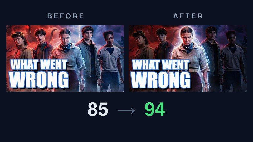
This week's thumbnail
Welcome to the first entry in a weekly series. The format is simple: we take the thumbnail of a famous or trending video, run it through our AI critique, apply the fix it recommends with AI Improve, and publish the before/after — scores, reasoning, and all. Real thumbnails from real videos, treated exactly the way the tool treats yours.
This week: Friendly Space Ninja's "Stranger Things 5: A Historic Fall From Grace", a feature-length breakdown of how television's biggest show landed its final season. Commentary channels live and die by packaging — the video is about what went wrong, and the thumbnail has one job: make you need to know the answer.
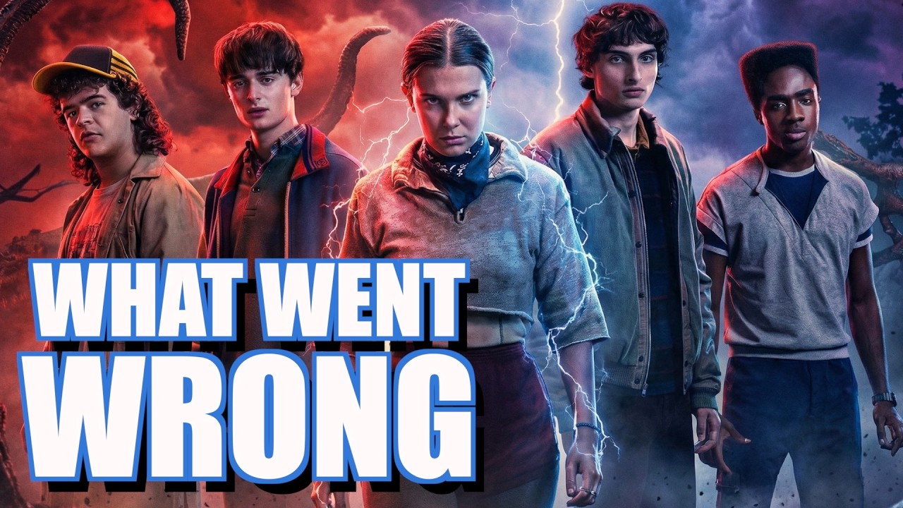
It's a strong piece of packaging: the five leads against a split red-blue storm sky, tentacles overhead, and "WHAT WENT WRONG" in enormous white type with a blue edge. So what does the critique make of it?
Before: what the critique found
The AI critique scored it 85 overall — visual 84, title fit 88 — landing it in the "Strong" band with high confidence. That's a good thumbnail, and the sub-scores show why.
What it praised:
- Legibility: "The white three-word headline remains large and easy to read in the 168×94 rendition." That tiny size is roughly what a phone feed shows — the single most common way anyone sees a thumbnail.
- Contrast: "White text with blue edging and black shadow stands out strongly against the red and blue background."
- Topic match: the cast lineup and supernatural storm instantly say Stranger Things, so the click promise is honest.
Where it docked points:
- Hierarchy: "The five-character lineup creates several competing faces above the headline." Your eye has nowhere to land first.
- Curiosity: "WHAT WENT WRONG creates a clear problem question without explaining which character or event caused it" — good, but the image itself doesn't add to the question.
- Promise consistency: the headline "supports the title's claim of a fall from grace, but the image does not show what specifically fell or why."
The one fix it recommended
The critique came back with a single action item:
Establish a single focal point. Five faces compete for attention while the headline already occupies most of the lower half. Make the central girl slightly larger or brighter and reduce the visual emphasis of the four surrounding characters. Expected effect: viewers will identify the main subject faster before reading the headline.
Notice what it didn't say: nothing about the colors, the fonts, or the composition being wrong. The critique isn't asking for a redesign — it found the one structural issue in an otherwise strong image.
After: one click of Improve
We handed the critique to AI Improve and let it apply that fix. Here's what came back:
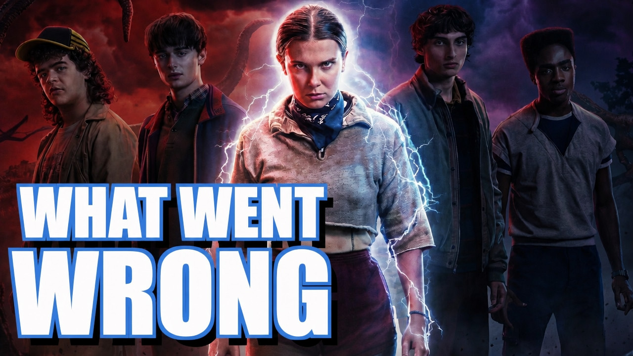
Same cast, same storm, same headline — but Eleven now glows at the center while the other four recede into the dark. The headline also picked up a heavier black shadow, which matters more than it looks: the letters now sit against darkness instead of jacket detail.
Re-critiqued from scratch, the variant scored 94 overall — visual 94, title fit 95 — jumping from "Strong" to "Exceptional." Four dimensions moved up a level:
- Hierarchy: the headline is now "the first thing visible at feed size," with "Eleven's brightly lit face and lightning" as a clear second beat.
- Curiosity: the intense expression, lightning, and threatening sky now "suggest a major story development" instead of a group photo.
- Trust and polish: the image reads as deliberately art-directed rather than promotional collage.
- Promise consistency: a single haunted figure under "WHAT WENT WRONG" actually shows a fall from grace.
The head-to-head
Scoring the two images independently is one thing; we also ran a direct comparison, where the AI judges them side by side as feed neighbors. The verdict: the improved version wins, though it calls the win "slight" — this was an 85 to start with, not a disaster.
Its reasoning, verbatim: "Its large two-line 'WHAT WENT WRONG' headline remains especially clear at 168×94, while the darker lower background keeps the white letters separated from the characters. B shows the faces and red-blue lighting a little more brightly, but the headline competes more with the busy image."
The comparison was also honest about what the original does better: its brighter lighting "reveals the surrounding faces and clothing a little more clearly." That's the trade the fix made — four supporting faces got darker so that one face and three words could get louder. At feed size, that trade wins.
And even at 94, the critique of the variant still had a suggestion: the thumbnail's question and the video's title both promise the same negative story, so a phrase that adds a new angle — its examples: "THE BIGGEST MISTAKE" or "WHY IT FAILED" — would let the title and thumbnail carry two hooks instead of one. There is always a next move.
Three things to steal
- One face, not five. If your thumbnail has multiple people, pick a protagonist and light them like one. Every face you add divides attention the way an extra tab divides focus.
- Buy your text its own background. The improved version's biggest legibility win wasn't a font change — it was darkening the pixels behind the letters. Stroke and shadow help, but separation is what reads at 168×94.
- Don't spend the thumbnail repeating the title. They render next to each other in the feed. If the title makes the claim, let the thumbnail ask the question — or show the evidence.
Run your own teardown
The exact flow in this post is free to try: drop your thumbnail into ThumbnailPeak, run a critique, then apply the suggested fixes with AI Improve and compare the results side by side — no sign-up needed for either. If you'd like your thumbnail — or a famous one you're curious about — torn down in a future entry, we're listening.
Thumbnail imagery belongs to its creator and is shown here for commentary and education. This teardown analyzes packaging only — the video itself is excellent, which is rather the point: even great packaging on a great video can leave a click on the table.