
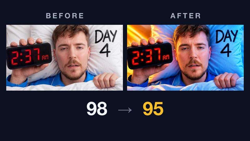
This week's thumbnail
Three teardowns in, the format has a rhythm: critique finds a gap, Improve closes it, the head-to-head confirms it. Teardown #2 was the exception — a 99 with nothing to fix, so we didn't try. This week we tried.
The subject: MrBeast 2's "A Week In The Life of MrBeast", published August 24 on the second channel. At the time of writing it's closing in on 29 million views in under three weeks, one of that channel's biggest uploads of the year.
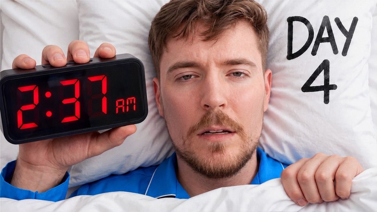
It's a quiet image by MrBeast standards. No explosion, no stack of cash, no crowd. A tired man, a clock, two words on a pillow. And that restraint is the whole trick, because every one of those elements is doing a specific job.
Before: what the critique found
It scored 98 overall — visual 98, title fit 100 — landing in the "Exceptional" band with high confidence. That title-fit number is a first for this series. Teardown #1 topped out at 95 on fit, #2 at 93, #3 at 88. This one is the first pairing the rubric couldn't fault at all.
Nine of ten dimensions came back at the top level. The evidence reads like a checklist of things most thumbnails get wrong:
- Legibility: "The red 2:37 AM clock remains readable at 168×94," and "the black DAY 4 text is large and clear at feed size." That size is a phone feed, and it's the size that matters.
- Hierarchy: "MrBeast's face is the dominant subject, with the clock and DAY 4 supporting it on opposite sides." One face in the middle, one prop on each side. Nothing competes.
- Contrast: "The red clock digits stand out against the black clock, and the black DAY 4 text stands out against the white pillow." No stroke, no glow. The props carry their own contrast.
- Curiosity: "The 2:37 AM wake-up time and DAY 4 label create a clear question about what happens during the week."
- Title complementarity: "The title identifies the week-in-the-life concept while the thumbnail adds the specific DAY 4 and 2:37 AM detail."
That last one is where the 100 comes from. The title says a week. The image says day four, 2:37 in the morning. Neither repeats the other, and together they make a sentence: this week has been rough. It's the split-the-work pattern we praised in teardown #2, executed with text this time — and the text is a detail, not a headline.
The one thing it docked
The only dimension a level down was distinctiveness: "The combination of MrBeast, a visible alarm clock, and a day marker is recognizable, though it follows a familiar challenge-thumbnail format."
That produced the entire punch list — one low-priority action: differentiate from the genre norm. "Change the element that makes this blend into similar videos," so that "the thumbnail stands out in the genre grid."
Fair enough. Man-in-bed-with-a-clock is a shape you've seen before. But notice what the critique is not asking for. Not a bigger face, not more text, not a different emotion. It's saying the image is correct and asking whether it could be more itself.
After: the score went down
We let AI Improve apply that single action. Here's what it did:
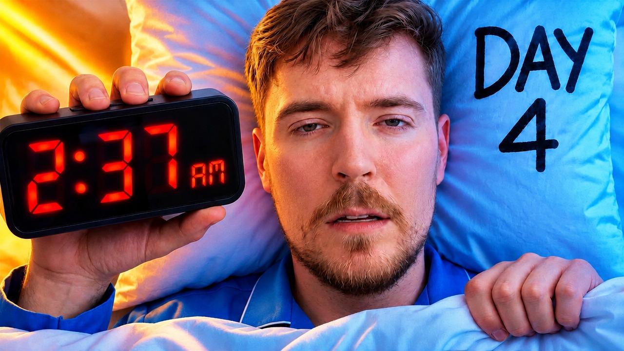
Nothing moved. Same pose, same clock, same time, same pajamas, same "DAY 4" in the same corner. What changed is the light: an orange lamp glow from the left, the white bedding turned cool blue, and a warm-on-cool split across MrBeast's face. It's the classic teal-and-orange grade, and it's a defensible answer to "make this less like every other bed thumbnail," because the flat white scene was the thing that read as generic.
Re-critiqued from scratch, the variant scored 95 overall — visual 94, title fit 100. Still "Exceptional." Still a perfect fit. But three points lower, and the dimension-by-dimension read shows exactly where they went.
Curiosity dropped a level. The evidence is nearly identical — "the 2:37 AM alarm clock raises a clear question about what happened during the week" — but the rubric read the stylized version as a slightly weaker question. There's a plausible reason: the original looks like a still from the actual video. The variant looks like a poster. A still promises footage; a poster promises a mood.
Distinctiveness didn't move. This is the one that stings. The action targeted it, the critique acknowledged the effort — "the bright orange-and-blue lighting makes it more distinctive than a standard portrait" — and then held the level at 3 anyway, because "the sleeping-in-bed setup and oversized alarm clock give the image a recognizable visual idea." The relight earned a compliment, not a level. The genre-norm note came back on the variant's punch list, and it brought a friend: "strengthen the value promise: make the payoff of clicking more concrete." One low-priority action became two.
By the scores, the fix made the thumbnail worse. Which would normally be the end of the story.
Which would you click?
Before you read the verdict, do the honest version of this test. Here they are at 168×94, the size a phone feed shows them, with no scores attached:
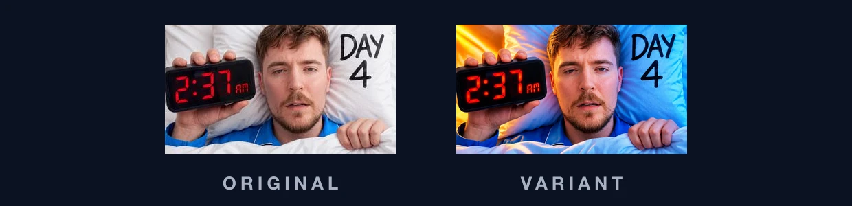
Pick one. Not the one you admire, the one your thumb stops on. Hold that answer.
The head-to-head
We ran the two through a direct comparison, where the model judges them side by side as feed neighbors rather than scoring each in isolation. In the report the variant is A and the original is B.
The verdict: the variant wins, by a hair. Verbatim: "A is more eye-catching at feed size. The orange-and-blue lighting makes MrBeast, the red 2:37 AM clock, and the blue background separate quickly. B is cleaner and more natural, but its pale bedding gives the thumbnail less visual punch. Both keep 'DAY 4' and the clock readable at 168×94."
And then the report did something we haven't seen in this series. It marked its own confidence low, in red, and attached a warning: "The head-to-head verdict and the two individual scores point in different directions — treat this comparison with extra care."
That warning is automatic. The comparison knows what each image scored on its own, and when the judge picks the lower-scoring one it says so instead of pretending the two readings agree. The split is even in the details, two to two:
- Feed-size impact — variant. "A's strong orange-and-blue color split stands out more than B's mostly white bedding."
- Subject separation — variant. "A's warm face lighting and blue shirt separate MrBeast more clearly from the background than B's flatter skin-and-bedding tones."
- Text and clock clarity — original. "B's black 'DAY 4' has a lighter background behind it, while A's text sits on blue; both remain readable, but B has slightly cleaner text contrast."
- Visual polish — original. "B uses softer, more natural lighting and looks less heavily processed than A."
Read those together and the two verdicts stop contradicting each other. The critique grades craft: is the question sharp, does the image look true, does it hold up to scrutiny. The head-to-head grades the half-second: which tile grabs the eye first. The variant bought a louder half-second and paid for it with a little polish and a little curiosity. Both instruments are reporting accurately. They're measuring different moments of the same click.
Which brings you back to your answer. If you picked the variant, you agree with the judge. If you picked the original, you agree with the critic. Neither of you is wrong, and that's the point: at this level the tool can't decide for you, because the decision is a trade, not a fix.
What a 98 buys you
One more thing to be honest about. A score of 98 is a statement about the image, not about the outcome. This thumbnail is on MrBeast 2, the second channel, and it draws second-channel distribution — plenty, but not the main channel's hundred-million-view league. That gap is a fact about where the video was published, not about the pixels.
What the score can tell you is narrower: against the neighbors it lands beside, this tile will win its share of the eye. And on that channel, where a regular challenge upload draws somewhere between five and ten million, this one is at three to five times that. The packaging is doing its job. The job just isn't "make the audience bigger."
Three things to steal
- Be specific, not loud. 2:37 AM is a better piece of text than "NO SLEEP." It's a detail from the video, it fits the title without repeating it, and it hands the viewer a question instead of an adjective. That specificity is what a perfect title-fit score looks like.
- At the ceiling, every change is a trade. When your critique comes back with one low-priority note, the honest question isn't "how do I fix it" but "what will I give up to fix it." This relight traded a point of curiosity and some naturalness for feed punch. Sometimes that's a trade worth making. It is never free.
- When the critic and the judge disagree, that's your A/B test. A three-point score drop and a by-a-hair verdict the other way is the tool telling you it's close. MrBeast's team answers questions like this with YouTube's built-in thumbnail testing, not with a stare-down. If you have the feature, this is exactly the pair to put into it.
Run your own teardown
Everything in this post is free to try: drop your thumbnail into ThumbnailPeak, run a critique, apply the suggested fixes with AI Improve, and put the two side by side — no sign-up needed for any of it. The live comparison from this post is public here if you want to see the verdict card for yourself. And tell us which one you picked; we're keeping count.
Thumbnail imagery belongs to its creator and is shown here for commentary and education. This teardown analyzes packaging only. The video shipped with the original image and is doing very well with it, which is worth sitting with: our fix scored lower, our judge preferred it anyway, and the creator's own answer is the one already in the feed.