Disclosure: we make ThumbnailPeak. Every score below is from its AI critique and every redo is from its Improve tool, run on 15 November 2026. A score is our critique's opinion of a picture, not a count of clicks. The four thumbnails belong to their creators, who shared their videos under a Creative Commons license and had nothing to do with this post. The redone versions are ours, not theirs.
To improve a YouTube thumbnail, find the one or two things that hold it back, change only those, and then check that the change didn't break something else. If you're not happy with your thumbnail, you don't need a new design.
We did exactly that to four real thumbnails on 15 November 2026. Here is what happened:
- Two of the four scored clearly higher, and two stayed about the same. Our critique scored them 62 → 72, 74 → 81, 65 → 68 and 75 → 77 out of 100.
- The design was kept on the three that have words. On those, 14% to 18% of the picture changed. The layout and the colors stayed. On the two that show a person, the face still looked like the same person.
- A redo moves a lower-scoring thumbnail more than a higher-scoring one. People used Improve on our site 345 times from 24 October to 15 November. Thumbnails that started under 75 moved a median of 4 points, meaning half moved more and half moved less. Those that started at 75 or more moved a median of 1 point.
- Read the result before you use it. One redo left a headline that no longer asked its question, and one redrew a loaf of bread.
How we tested
We took 24 thumbnails from Creative Commons videos in six kinds of video and ran them through our AI critique, each with its video's title. They scored 62 to 91.
Then we picked four. The rule was set before any redo. Each had to score under 80. The critique lists its fixes in order, and the first fix on the list had to be different for each of the four, so they show four different problems. We did not pick them by how the redo turned out, and every redo we ran is in this post.
Each of the four got one try in Improve with the option called Keep my design, which makes the critique's fixes to the design you have. We ticked every fix the critique offered, typed nothing, and kept the first result.
Step 1: find what works and what doesn't
Start by looking at your thumbnail small. Zoom out in your editor until it is about 168 pixels wide, the small size our critique checks every thumbnail at. If your editor doesn't show the width, open the thumbnail in our free preview, which shows it in a YouTube feed beside real videos. At that size, ask three plain questions:
- Can I read the words?
- Is there one place my eye goes first?
- Can I tell what the video is about?
Our post on what makes a good YouTube thumbnail has the full list of ten checks. The point of this step is to sort what you see into two piles: what to leave alone, and what to change.
The "leave alone" pile matters as much as the other. A redo that touches what already works is no longer a small redo.
Step 2: change one or two things, and only those
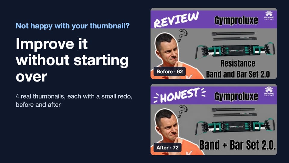
Words too small to read: 62 → 72
UK Home Gym's review of a resistance band set had a caption along the bottom, "Resistance Band and Bar Set 2.0". The critique said "the product name along the bottom is too small to read quickly" and suggested shortening it to "Band + Bar Set 2.0".
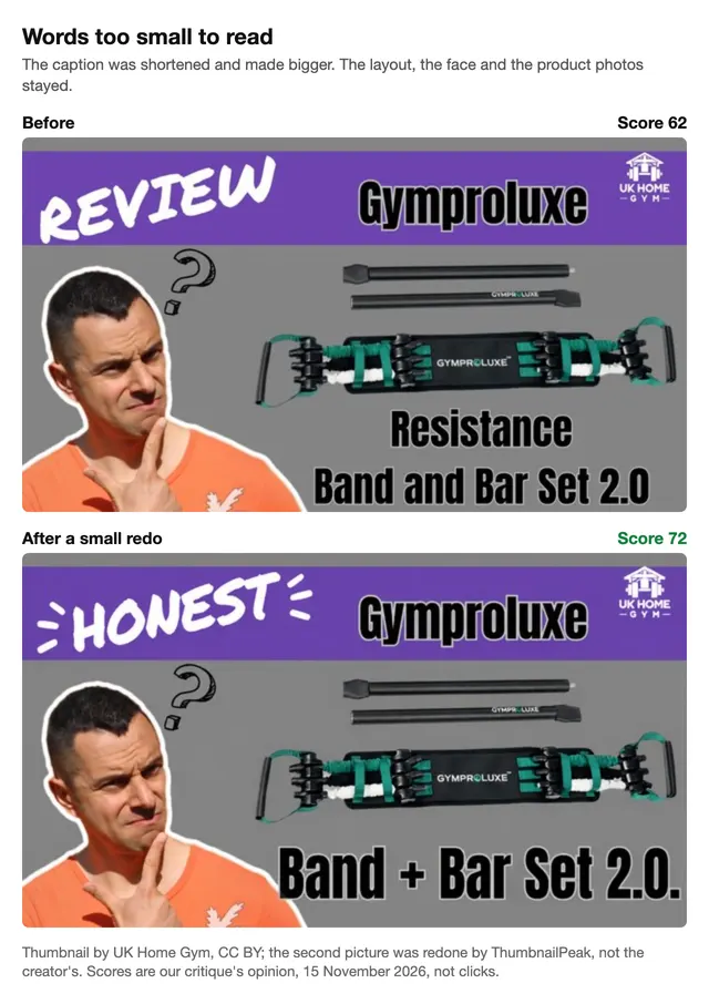
The redo did that. Everything else stayed: 14% of the picture changed. The score went from 62 to 72. The critique also grades each of its checks out of 4, and its grade for legibility, which means how easy the words are to read, went from 2 to 3.
Two things were not as asked. The redo changed "REVIEW" to "HONEST", under a fix to repeat less of the title. But the title is "Gymproluxe Band and Bar Set 2.0: An Honest Review", so "Honest" is in the title too, and the next critique still said the words repeat it. And there is a stray period after "2.0". Small slips like that are why you read every word before you upload.
The subject was too small: 74 → 81
Victoria Rose's video is about baking sourdough over a fire in the woods. The thumbnail showed her, her dog, the fire and a pot, with the question "WHAT AM I DOING?". The critique liked the scene but said "the loaf is small and difficult to recognize" and "the headline does not mention baking".
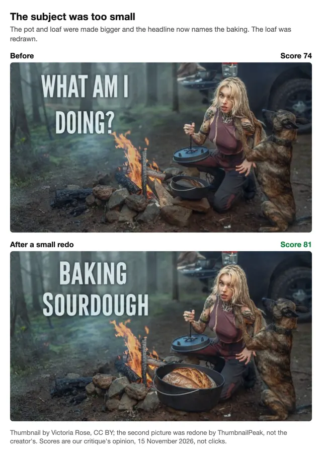
The plan said to make the pot and the loaf about a fifth bigger. The picture that came back has a pot nearly twice as wide, and the words changed to "BAKING SOURDOUGH". The woman, the dog, the fire and the forest stayed. The score went from 74 to 81.
The loaf was redrawn. The new one has a golden, scored crust that is not the bread in her photo. If your video shows a pale, flat loaf, a thumbnail with a perfect one promises something the video doesn't deliver. If a redo redraws your subject, put the real one back.
The next critique also said the new headline repeats the title, which the old question did not. More on that in Step 3.
A busy background: 65 → 68
Nicky's Kitchen showed a slice of what the title calls a pancake cake, with a second cake cut off by the top edge of the frame. There are no words on it. The critique offered one fix: "crop tighter around the foreground slice and plate to remove most of the background cake".
A crop is something anyone can do by hand, so we did it both ways.
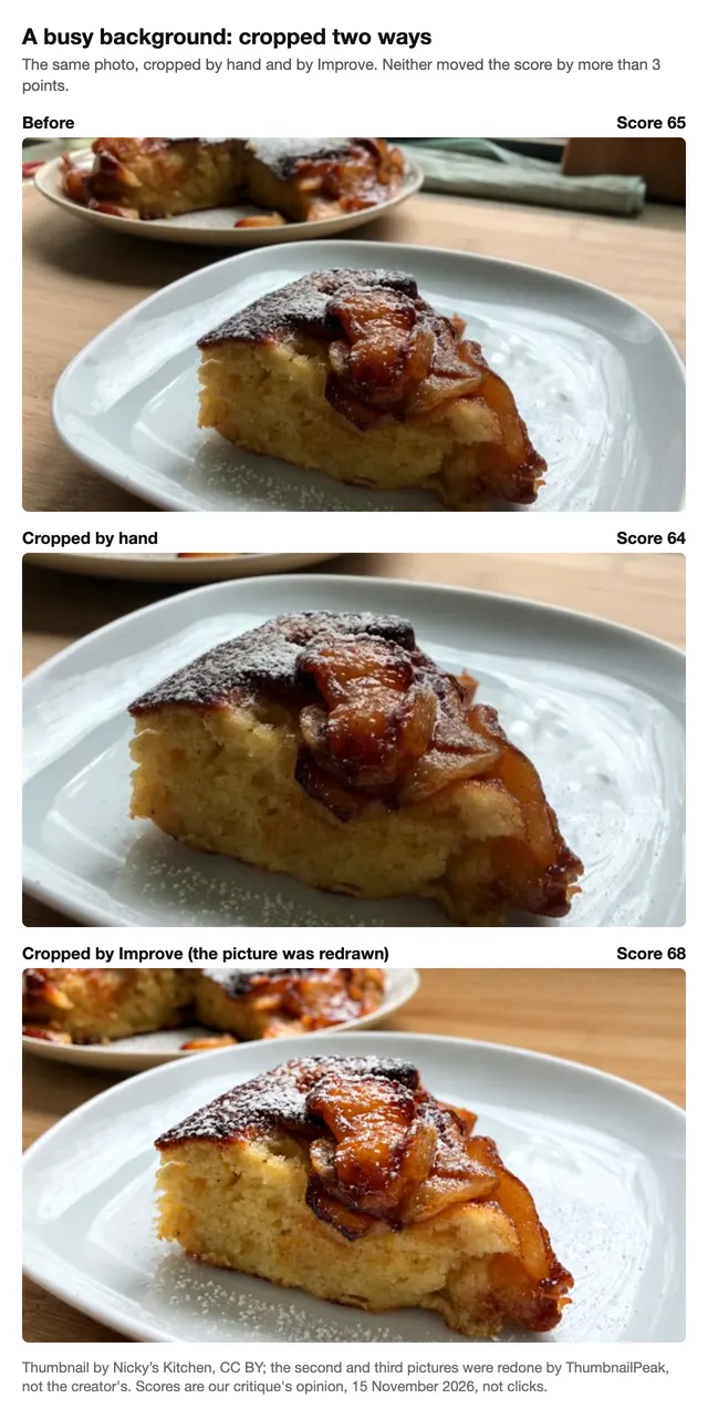
Our hand crop removed the second cake and scored 64. Improve's version scored 68. Look at it closely: part of the second cake is still there, and the whole picture was redrawn. The crumb and the powdered sugar are not the same as in the photo. The next critique asked again to remove the second cake. All three scores are about the same.
So on this thumbnail, taking the background away did not move the score. The critique of Improve's version asked for something no crop can give: to "show a cut edge or stack of layers that makes the pancake-cake structure visible". That needs a different photo. Some thumbnails don't need a fix. They need a better picture of the thing.
Words that repeated the title: 75 → 77
pyurologie's title is "Building a Budget PC That Gets 60+ FPS on Streets in 2025". Streets is a map in the game Escape from Tarkov. The thumbnail said "60+ FPS ON STREETS WITH THIS?". The critique said the computer was "large and easy to recognize" in "a clear two-part layout". It offered three fixes: stop repeating the title, add a budget label, and give the lower two lines more contrast against the pale wall.
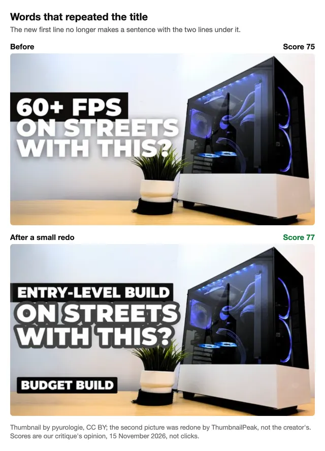
The redo made all three changes, and the score went from 75 to 77: about the same. The outline worked, and the grade for contrast went from 2.9 to 4 out of 4.
But read the new headline: "ENTRY-LEVEL BUILD ON STREETS WITH THIS?" The old headline asked a question: can this PC reach 60+ FPS? The new one has lost "60+ FPS", so it no longer asks anything. Each fix was reasonable by itself, but the first one took out the words the question depended on.
This was also a redo with three fixes at once, not one or two. If your list has three fixes, make the first one or two and look at the result before you make the third.
Doing each fix by hand in Canva or any editor
You don't need our tools for any of this. In Canva, Photoshop, Photopea or any editor with layers:
- Words too small. Cut the words first. Then make what is left as large as the space allows, and look at it small again.
- Subject too small. Scale the subject up, or crop the photo so the subject fills more of the frame. Use your real photo.
- Busy background. Crop tighter, or blur and darken the background a little. If the picture gets soft when you enlarge it, start from the full-size photo (here is why a thumbnail looks blurry).
- Pale words on a pale background. Add a dark outline or a dark box behind the words.
- Words that repeat the title. Write the one thing the title doesn't say: the result, the price or the surprise. Then read the whole headline aloud.
If you have only the finished image and no layers, you can type one change at a time into an AI editor instead.
Step 3: read the result, then stop after one round
Every one of our four redos had something to catch: a stray period, a redrawn loaf, a redrawn cake, and a headline that no longer asked its question. So read the result before you use it. Then stop.
Here is why. After the PC redo, we ran the critique again. It said: "The title promises 60+ FPS, but the headline does not show that result", and suggested "60+ FPS ON STREETS?". Those are the words the first critique asked us to remove.
The same thing happened on the campfire thumbnail. The first critique wanted a headline about baking. The redo wrote "BAKING SOURDOUGH". The next critique said that repeats the title.
Neither critique is wrong. A thumbnail's words can do one of two things. They can repeat what the title promises, or they can say something new and leave the promise out. Each choice has a cost, so a critique can always ask for the other one.
This is why one round of fixes is the right amount. Fix what the first look found, then judge the result with your own eyes. If you keep fixing whatever the newest critique lists, you go in circles.
How much does a redo change the score?
On our four: +10, +7, +3 and +2 points. Four thumbnails are examples, so we also counted every time a real account used Improve on our site from 24 October to 15 November 2026: 345 times, by 228 accounts. That count includes both of Improve's options: 160 runs with Keep my design, 122 with Bigger changes, which plans new words, a new layout or a new idea, and 63 from before the two options existed. The two options had the same median move.
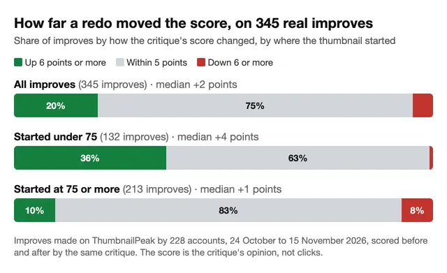
The median move was +2 points, and where you start matters: +4 for thumbnails that started under 75, +1 for those at 75 or more. In this post we call a move of 5 points or less, up or down, "about the same", because two critiques of one picture can differ by a few points.
So a redo is a small change in score for most thumbnails, and the score moves most when it starts low. If your thumbnail already scores 75 or more, a redo seldom moves the score: 83% stayed within 5 points. When the score does move, it goes down (8%) almost as often as it goes up (10%). That is a good time to leave the thumbnail alone, or to test a different idea.
What this means for your thumbnail
- Sort first. Look at it small, and decide what stays before you decide what changes.
- Fix one or two things, once. Then stop and judge it yourself.
- Read the result. Check every word, check that the headline still makes sense, and check that the subject is still the real one from your video.
- Know when a fix won't do it. If the thumbnail already reads well, or the problem is the photo, a redo changes little. Try a new photo or a new idea, and test it against the old one.
To get the "what works and what doesn't" list for your own thumbnail, run it through a critique, which costs 1 credit. Improve costs 3 credits and makes the fixes for you, with Keep my design or Bigger changes. A free account comes with 12 credits. Before you upload either version, preview it in a YouTube feed beside real videos, which is free.
Frequently asked questions
How do I make my YouTube thumbnail better without redesigning it?
Look at it at about 168 pixels wide, find the one or two things that fail at that size, and change only those. On our four test thumbnails, that moved our critique's score by 2 to 10 points while 14% to 18% of the picture changed on the three with words.
What are the most common YouTube thumbnail mistakes?
On the 24 thumbnails we scored, the most common first fix was to stop repeating the title (9 of 24). The four we fixed show four mistakes: words too small to read, a subject too small to recognize, a background that competes with the subject, and words that repeat the title.
Will improving my thumbnail get more clicks?
We can't measure that, and nobody outside your channel can. YouTube shows click-through rate only to the channel. Our scores are a critique's opinion of the picture. To find out what viewers do, use YouTube's own Test & Compare.
Should I change the thumbnail on a video that is already published?
You can, at any time. We wrote about when it is worth changing an old video's thumbnail. If the current one is doing well, test the new one instead of swapping it.
Can AI fix my thumbnail without changing my face?
In our four redos, both faces still looked like the same person with the same expression. Other parts did change without being asked: a loaf of bread and a slice of cake were redrawn. Compare the new version with the original before you use it.
How we tested: on 15 November 2026 we searched the YouTube Data API for Creative Commons videos with six searches. We kept the first five results per search that had a 1280×720 thumbnail and an English title, one per channel. That gave 30 videos. We left out 6 before scoring and ran 24 through ThumbnailPeak's critique (GPT-6, seven runs averaged) with each video's title. The four were chosen by score (under 80) and first fix, before any redo. Each got one Improve with Keep my design, every offered fix ticked and no typed request, then a new critique. For one of the four, Improve could not use its own detailed plan, so it worked from the critique's fixes as written; the site does the same for any user. The share of the picture changed counts pixels that moved by more than 24 of 255 on any color channel at 640×360. The 345 improves are those made by signed-in accounts from 24 October to 15 November 2026 with both scores from the GPT-6 critique, leaving out our own; some people use more than one account. On the site, Improve's result page uses "About the same" only for a drop of 5 points or less.
The thumbnails are from "Gymproluxe Band and Bar Set 2.0: An Honest Review" by UK Home Gym, "The FAMOUS pancake cake that everyone love! Quick and easy recipe." by Nicky's Kitchen, "I'm Alone in the Woods, Baking Sourdough Over a Fire" by Victoria Rose, and "Building a Budget PC That Gets 60+ FPS on Streets in 2025" by pyurologie, each published under YouTube's Creative Commons Attribution license (CC BY). The "after" versions are adaptations made by ThumbnailPeak. The creators did not make or approve them.