Disclosure: we make ThumbnailPeak. The figures here come from its critique, which is an AI's judgement of each thumbnail, not a count of clicks. How we got them is at the end.
Every list of thumbnail tips says the same things: big text, bright colours, a face, strong contrast. What a list can't tell you is which of those your thumbnail is missing.
ThumbnailPeak's YouTube thumbnail analyzer checks ten things. Seven are about the picture. Three are about how the picture works with your title. Between 15 August and 21 October 2026, people ran 4,921 different thumbnails through it, so we can say more than what a good thumbnail does. We can say where real thumbnails fall short.
Here is what we found:
- Contrast is rarely the problem. 73% of thumbnails got the top grade for it. The advice you've read most is the advice most creators have already taken.
- Words at small size cost the most points. Legibility was the biggest single loss on 38% of thumbnails. Most text reads fine at full size and breaks up at 168×94, the size of YouTube's sidebar.
- Most thumbnails show the topic and stop there. Only 23% got the top grade for curiosity. The most common first fix was to give viewers a clearer reason to click.
- Few thumbnails look different from their genre. Only 11% got the top grade for distinctiveness.
- When there's a title, the fit is often the first fix. Of the thumbnails checked with a title, 31% got a first fix about how the picture works with it.
How a thumbnail score is built
Each of the ten checks gets a grade from 0 to 4:
- 0: fails badly
- 1: a major weakness
- 2: usable, but noticeably weak
- 3: strong, with minor issues
- 4: exceptional
The AI grades your thumbnail three separate times, at full size and at 168×94, and each check takes the middle of its three grades. Then code, not the AI, turns the grades into a score out of 100.
The checks don't all count the same. Here is what each one is worth in the picture score:
- Legibility: 20 points
- Hierarchy: 20
- Subject clarity: 15
- Contrast: 15
- Curiosity value: 15
- Distinctiveness: 10
- Trust & polish: 5
A 4 earns all of a check's points, a 3 earns three quarters, a 2 half, and so on. So a 3 for legibility costs 5 points, and a 3 for trust & polish costs just over 1.
If you add your title, three more checks grade how the picture works with it: topic match (worth 50 of 100 fit points), promise consistency (30) and title complementarity (20). The overall score is 85% picture and 15% fit. Then comes a band: Exceptional from 90, Strong from 75, Solid from 60, Developing from 40, and Weak below that.
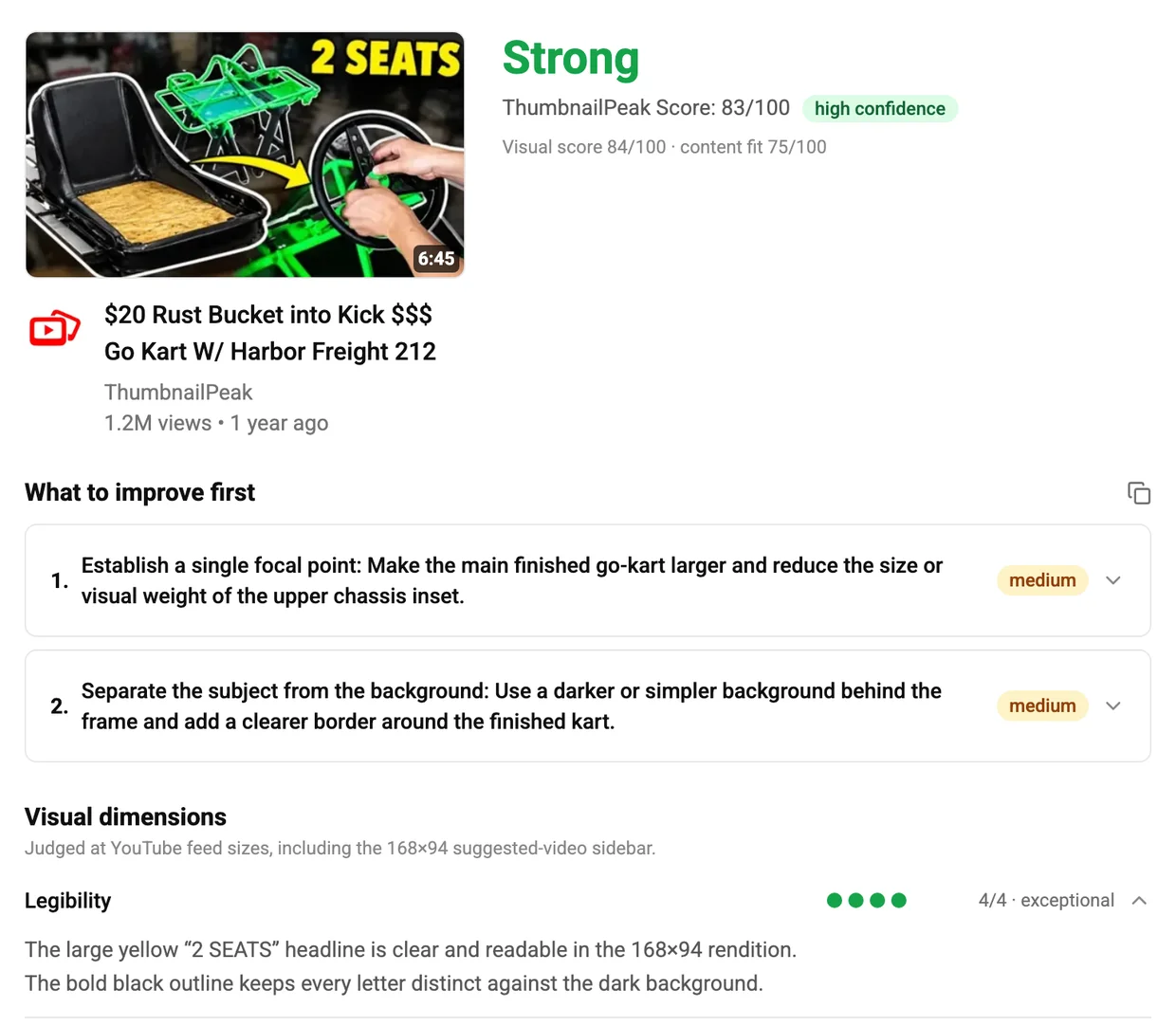
Here's one worked through. "2 SEATS", a go-kart thumbnail our generator made for another post, got 4 for legibility and contrast and 3 for the other five picture checks. That's a picture score of 84. Its three fit checks were all 3, a fit score of 75. 85% of 84 plus 15% of 75 makes 83: Strong.
Where the points go
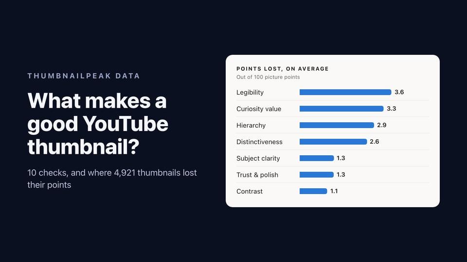
The average picture score was 84, so the average thumbnail lost about 16 points. This is where they went.
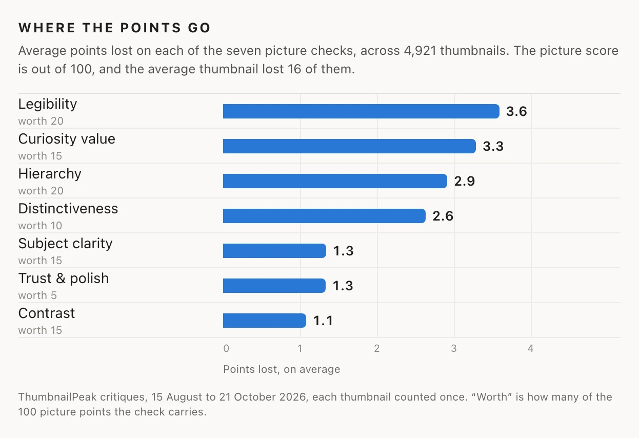
Legibility, curiosity and hierarchy took three fifths of the lost points. Contrast took 7%.
What a check costs depends on two things: how often thumbnails fall short on it, and what it's worth. Trust & polish was the lowest of the seven grades more often than any other check, but it's worth 5 points, so it costs little. Legibility is worth 20, and only 40% of thumbnails got a 4, so it costs the most.
Here is how often each grade was given:
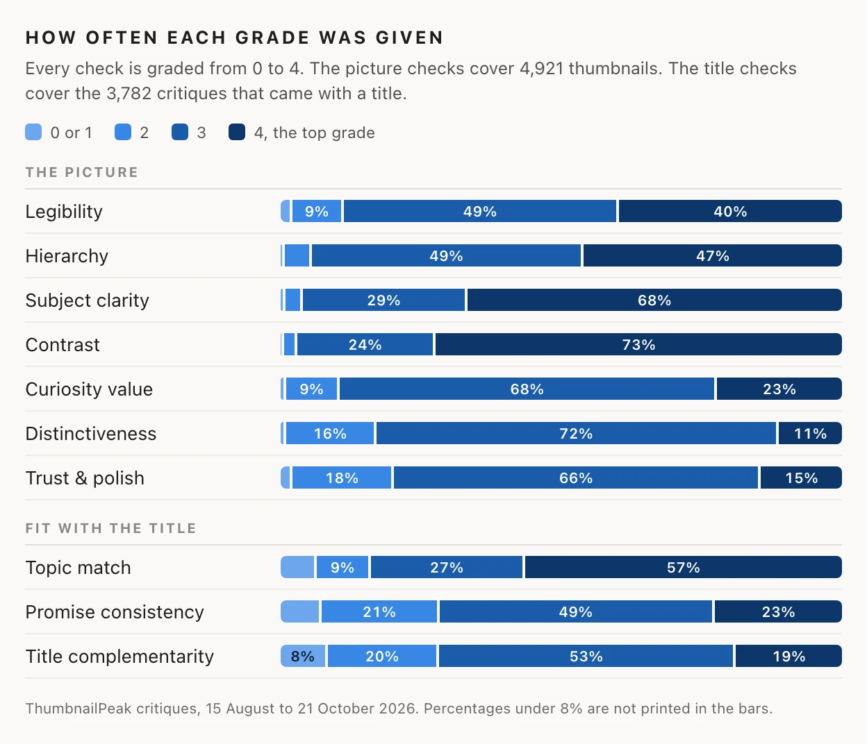
Only 22 of the 4,921 thumbnails got a 4 on all seven picture checks.
Now the ten checks, one at a time: what each asks, how the 4,921 thumbnails did, what the critique says when a thumbnail falls short, and what to do about it. The quotes come from reports we've published in earlier posts, and each one links to its report. Several are of thumbnails our own generator made, and we say which.
1. Legibility: can it be read at 168×94?
Worth 20 points. 40% got the top grade, and 10% got 2 or lower.
Legibility asks whether every word and the key detail can still be read at 168×94 pixels, the size of YouTube's suggested-video sidebar. A thumbnail with no words isn't marked down for it. It's graded on whether its important detail is still recognisable at that size. DIY PRO's go-kart thumbnail has no text, and it got a 4: "The finished go-kart remains clearly recognizable at 168×94." (report)
Legibility costs more points than any other check. Most text reads fine at full size. It's at 168×94 that it fails:
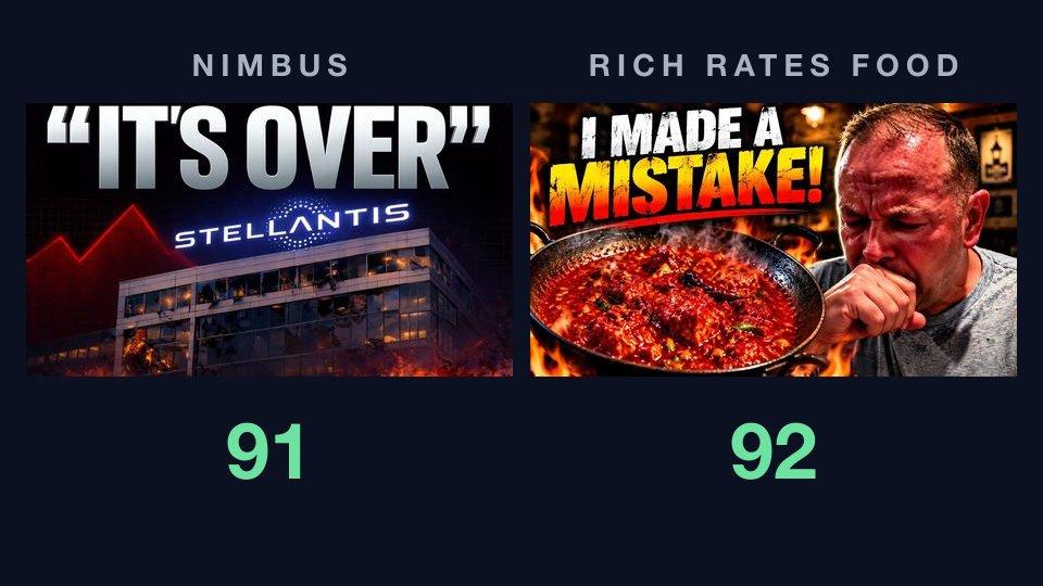
- "The white and yellow headline remains readable at 168×94, though the distressed texture breaks up parts of the letters." (Rich Rates Food, 3)
- "The white two-line headline remains clear at 168×94, though the smaller bottom branding is difficult to read." (vidIQ's thumbnail in this comparison, 3)
What to do: use fewer words, and make them bigger and heavier. Plain letters survive the shrink better than textured ones, and a dark outline helps. One report in five opened with a fix to the words, most often to make them bigger or use fewer of them. For type that holds up, see how to pick a font that still reads at feed size.
2. Hierarchy: is there one place to look first?
Worth 20 points. 47% got the top grade, and 5% got 2 or lower.
Hierarchy asks whether one thing clearly dominates, and whether the eye has a path from it to the rest. Few thumbnails fail it outright, but about half lose a level, and at 20 points a level costs 5.
"Establish a single focal point" was the first fix on 14% of thumbnails. It was in 27% of reports, which makes it, with "strengthen the value promise", the most common fix of all.
- "The overlapping seat, frame, wheel, hands, and arrow create several competing focal points." ("2 SEATS", our generator's, 3)
- "MrBeast's face is the dominant subject, with the clock and DAY 4 supporting it on opposite sides." (MrBeast's "A Week In The Life", thumbnail B in this comparison, 4)
What to do: decide what the thumbnail is about and make that the biggest thing in it. Shrink or cut what competes with it, background included: "simplify the background" was in 19% of reports.
3. Subject clarity: is it obvious what this is?
Worth 15 points. 68% got the top grade, and 3% got 2 or lower.
Subject clarity asks whether a viewer can tell at a glance what the thumbnail shows. Most can. When it slips, it's usually because the subject blends into what's behind it:
- "The Stellantis building is clearly the main subject, but its lower half blends into the fire and dark foreground." (Nimbus, 3)
What to do: make the subject bigger, crop closer, and keep effects off its edges.
4. Contrast: does it stand out from the background?
Worth 15 points. 73% got the top grade, and 2% got 2 or lower.
Contrast asks whether the subject and the words stand out from the background. It's the check thumbnails pass most easily, and it cost the average thumbnail about 1 point. Bright colours, dark outlines and blurred backgrounds are everywhere now, and they work:
- "The yellow headline and arrow stand out strongly against the dark workshop background." ("2 SEATS", 4)
What to do: if your report gives contrast a 4, spend your effort on the other six. If it doesn't, outline the subject or darken and blur what's behind it. And check that it still stands out for viewers who are colour-blind.
5. Curiosity value: does the picture give a reason to click?
Worth 15 points. 23% got the top grade, and 10% got 2 or lower.
Curiosity asks whether the picture itself raises a question the video answers. Two thirds of thumbnails got a 3: they show what the video is about, and stop there. That makes curiosity the second most costly check, and "strengthen the value promise" was the most common first fix, on 15% of thumbnails.
The difference between a 3 and a 4 is usually one specific detail:
- "The 2:37 AM wake-up time and DAY 4 label create a clear question about what happens during the week." (MrBeast's, thumbnail B in the same comparison, 4)
- "The phrase 'I MADE A MISTAKE!' paired with the man's distress creates a clear unanswered question about what went wrong." (Rich Rates Food, 4)
- "The serious portrait and single-word Destiny label create interest, but they do not reveal what the next chapter involves." (our generator's thumbnail in this comparison, 3)
- "The separate engine and bare kart frame suggest a build, but the thumbnail does not show the finished result or transformation." ("212 POWER", our generator's, 3)
What to do: show the moment before the payoff, what's at stake, or one detail that raises a question: a time, a number, a result. A question mark on its own doesn't do it.
6. Distinctiveness: would it be mistaken for any other video in its genre?
Worth 10 points. 11% got the top grade, and 16% got 2 or lower.
Distinctiveness asks whether the thumbnail looks like this video or like any video of its kind. It's the hardest check to get a 4 on. Using your genre's usual look isn't marked down by itself. What costs a level is having nothing beyond it:
- "The split-screen footballer comparison uses a common sports-thumbnail format without a distinctive visual idea." (a football thumbnail our generator made, report, 2)
- "The talking-head portrait, large white teaser text, and blurred background follow a common announcement-thumbnail pattern." (vidIQ's thumbnail in this comparison, 2)
What to do: keep the format your viewers recognise, and add one thing only your video has. On that football thumbnail, adding the club's crest and its stadium raised distinctiveness from 2 to 3. That post shows the before and after.
7. Trust & polish: does it look deliberate, and honest?
Worth 5 points. 15% got the top grade, and 20% got 2 or lower.
Trust & polish asks whether the thumbnail looks clean and deliberate, and whether it claims more than it should. It catches two kinds of problem. One is technical: blur, rough cut-outs, a subject cut off at the edge.
- "The image is soft at feed size, and the completed kart is cropped at the right and bottom edges." (DIY PRO's go-kart, report, 3)
- "The heavy glow around the woman and cards gives it a strongly composited look." (our generator's thumbnail in this comparison, 3)
The other is exaggeration:
- "The destroyed-looking building and flames make the thumbnail feel highly dramatized for a corporate news topic." (Nimbus, 2)
It's worth only 5 points, so a 2 costs about 2.5. But the fix list doesn't rank problems by points alone. It also weighs how serious each one is, so Nimbus's report still put "remove the misleading element" first, at high priority. That teardown has the whole story.
What to do: start from a sharp image at 1280×720 or bigger, clean up cut-out edges, and exaggerate only what really happens in the video.
Fit with your title: three more checks
These run only when you give the critique your title or description, and the third needs the title. 3,782 of the critiques came with a title.
Fit is only 15% of the overall score, so it moves the number less than the picture does. It still matters: of the thumbnails checked with a title, 31% got a first fix about the fit.
A title that says nothing fails all three. In one of our tests, the same picture scored 85 against its real title and 78 against the placeholder "nice".
The critique can't watch your video. It reads your title and description as your own claim about the video, and checks the picture against that claim.
8. Topic match: is it visibly about what the video is about?
Worth 50 of the 100 fit points. 57% got the top grade, and 15% got 2 or lower.
Topic match asks whether the picture shows what the title says the video is about. Usually it does. When it doesn't, the thumbnail is often about something else entirely:
- "The Tokyo setting matches the title, but the thumbnail presents snacks rather than Pokémon fans or interview subjects." (vidIQ's thumbnail for a video about Pokémon fans, in this comparison, 1)
What to do: show the topic itself, not just its mood. If your title names a thing, a place or a person, put it in the picture.
9. Promise consistency: does it promise only what the video delivers?
Worth 30 fit points. 23% got the top grade, and 28% got 2 or lower.
Promise consistency asks whether what the picture promises matches what the title says. Promising more than the title does costs a level:
- "The thumbnail presents a more final and extreme outcome than the title's wording." (Nimbus, 3. The title says "on the brink". The thumbnail says "IT'S OVER".)
- "The shut eyes, flushed skin, hand over mouth, steam, and red curry support the title's claim of an extreme reaction." (Rich Rates Food, 4)
What to do: turn up what's true in the video. If the picture claims more than the title, cut the claim back or show the proof.
10. Title complementarity: does it add what the title doesn't say?
Worth 20 fit points. 19% got the top grade, and 28% got 2 or lower.
Viewers read the title and the thumbnail together, so the thumbnail shouldn't repeat the title. This check asks whether the picture adds something:
- "The title identifies the week-in-the-life concept while the thumbnail adds the specific DAY 4 and 2:37 AM detail." (MrBeast's, thumbnail B in this comparison, 4)
- "The thumbnail repeats the restoration idea but does not add visual support for the engine or kick-money parts of the title." ("RUST → GREEN", our generator's, 3)
What to do: let the title name the topic, and let the thumbnail show what the title doesn't say: the result, the reaction, the number. "Reduce overlap with the title" was a fix in 10% of reports.
What a thumbnail score can't tell you
- How many views you'll get. The critique grades the packaging. It's told not to predict click-through rate, and it doesn't try.
- What your audience knows. An in-joke or a running bit your viewers recognise can look generic to anyone else. What AI feedback can and can't tell you goes into this.
- Everything. It can miss things. In one test, it read a thumbnail that says "2 SEATS" and shows one seat as a two-seat build. Read your headline against your picture yourself.
And remember who these numbers come from. They're thumbnails people chose to check, not a random sample of YouTube, and 84% of them scored Strong or better overall.
A 10-point checklist before you publish
- Shrink it to 168×94. Can you still read every word?
- Where does your eye land first? Is that the right place?
- Could someone tell what it shows in a second?
- Do the subject and the words stand out from the background?
- Does the picture raise a question the video answers?
- Is there one thing in it that only your video has?
- Is it sharp and clean, and honest about what happens?
- Does it show the topic your title names?
- Does it promise only what the video delivers?
- Does it add something your title doesn't say?
Frequently asked questions
What is a good thumbnail score?
On ThumbnailPeak, 75 and up is Strong and 90 and up is Exceptional. Half the thumbnails people checked scored 85 or more overall. A score tells you whether a thumbnail is ready. The fixes under it tell you what to change.
Does a higher score mean more views?
Not on its own. The score grades the thumbnail and how it works with your title, not your topic, your audience or when you publish. To choose between two thumbnails that both score well, Compare puts them side by side and says which one wins and why.
What's the difference between a thumbnail checker and a thumbnail tester?
A checker, or analyzer, grades the thumbnail itself and tells you what to fix. That's ThumbnailPeak's critique. A tester shows you the thumbnail where viewers will see it, beside real videos. That's the thumbnail tester, which covers YouTube's home feed, search, suggested-video sidebar, phone and TV, and it's free with no account.
Check your own thumbnail
Run your thumbnail through the critique to get all ten grades, the reasons behind each one, and up to three fixes in order. A free account includes 2 critiques a month.
How we got these numbers: we counted the grades in every critique ThumbnailPeak ran between 15 August and 21 October 2026 with the current version of the critique. Each different image counts once, by its first critique: 4,921 thumbnails. We left out the images ThumbnailPeak's own generator and Improve make, which are critiqued automatically, and the critiques on our own account. The title-fit figures count every critique that came with a title, 3,782 in all, since the same picture can be checked against more than one title. We read only the grades and the fixes, not anyone's thumbnails or titles. The quotes come from reports we published in earlier posts. The go-kart thumbnails come from "$20 Rust Bucket into Kick $$$ Go Kart W/ Harbor Freight 212" by DIY PRO, published under the Creative Commons Attribution licence (CC BY 3.0); "2 SEATS", "212 POWER" and "RUST → GREEN" were made by ThumbnailPeak's generator, and DIY PRO did not make or approve them. Other thumbnails belong to their creators and are quoted here for commentary and education.