Disclosure: we make ThumbnailPeak, and this post tests its critique. Every score below is what it returned on 22 October 2026, on our own account. The photo is DashingHeights', published under a Creative Commons licence; the versions with our words on it are ours.
"Keep it to three words" is the most repeated thumbnail rule there is. We wanted to know whether successful thumbnails actually follow it, and what happens to a thumbnail when they don't.
So we counted. Here's what we found:
- Three words is the middle, not a rule. Across 16,199 recent thumbnails from 3,241 channels, the median was 3 headline words. 24% had none at all, and 5% had 10 or more.
- Breakouts didn't use fewer words. We compared each channel's biggest recent breakout with four of its ordinary videos. The breakouts had the same number of words, almost exactly: a median of 3, with 22.5% using none against 23.8%.
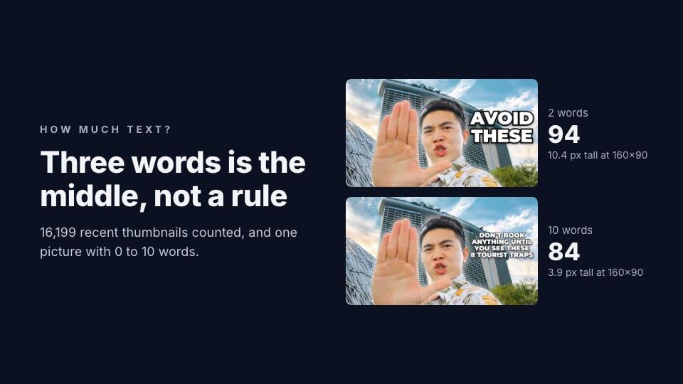
- More words means smaller letters. We put 0, 2, 4, 7 and 10 words in the same space on one picture. Two words came out 10 pixels tall on a phone's channel page; ten came out under 4, and a machine text reader got them wrong.
- Our critique liked two words best. The 2-word version scored 94 and the 7-word version 81. The critique's fix for 7 and 10 words was the same: shorten the headline.
How many words successful thumbnails use
We took ThumbnailPeak's Breakouts sample from 22 October 2026: recent videos in nine YouTube categories that got at least three times their channel's usual views. For each channel, we took its biggest breakout and its four most recent ordinary videos: ones that got about the channel's usual views. That's 3,241 channels whose titles are in a Latin-alphabet language, and 16,199 thumbnails.
Then we read the words on every thumbnail with Apple's on-device text recognition. We counted only headline-sized words: lines at least 8% of the picture's height. Logos, watermarks and small print don't count. A newspaper clipping in the background isn't a headline.
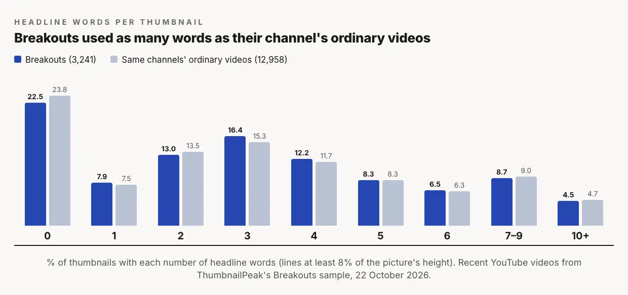
Three things stand out:
- Most thumbnails have a few words. Nearly half had one to four headline words. Among thumbnails with any, the most common count was three.
- A quarter have none. The picture does all the work. That's most common in Pets & Animals, where only 49% of thumbnails had a headline, and Film & Animation (65%). In Sports, 87% had one.
- Long headlines are rare. Only 1 thumbnail in 20 had 10 or more headline words.
The category differences are real, but small next to the spread inside each one. Every category's median was 2 or 3 words, except Pets & Animals, where it was 0.
Did breakouts use fewer words?
No. If short headlines helped a video break out, the breakouts should have fewer words than the same channel's ordinary videos. They didn't. Compared one to one, a breakout had fewer headline words than one of its channel's ordinary videos 34% of the time, more 35% of the time, and the same number 31% of the time. That's a coin toss.
That doesn't mean words don't matter. It means channels keep their own habit, and the habit didn't change when a video took off. A channel that writes four words wrote four on its breakout too. What changed was the idea, and what those words said about it. We found the same thing for faces, colours and layout, which we cover in why YouTube thumbnails matter.
One picture, 0 to 10 words
To see what word count does to a single thumbnail, we took DashingHeights' thumbnail for "8 BIGGEST Tourist Traps in Singapore": the creator holding up a hand in front of Marina Bay Sands, with "AVOID THESE" in red. With ThumbnailPeak's Edit, we removed its words and icons. Then we set five headlines in the same space on the right, in the same font, each as large as would fit:
- 0 words
- 2 words: AVOID THESE
- 4 words: 8 TRAPS TO AVOID
- 7 words: SKIP THESE 8 TRAPS ON YOUR TRIP
- 10 words: DON'T BOOK ANYTHING UNTIL YOU SEE THESE 8 TOURIST TRAPS
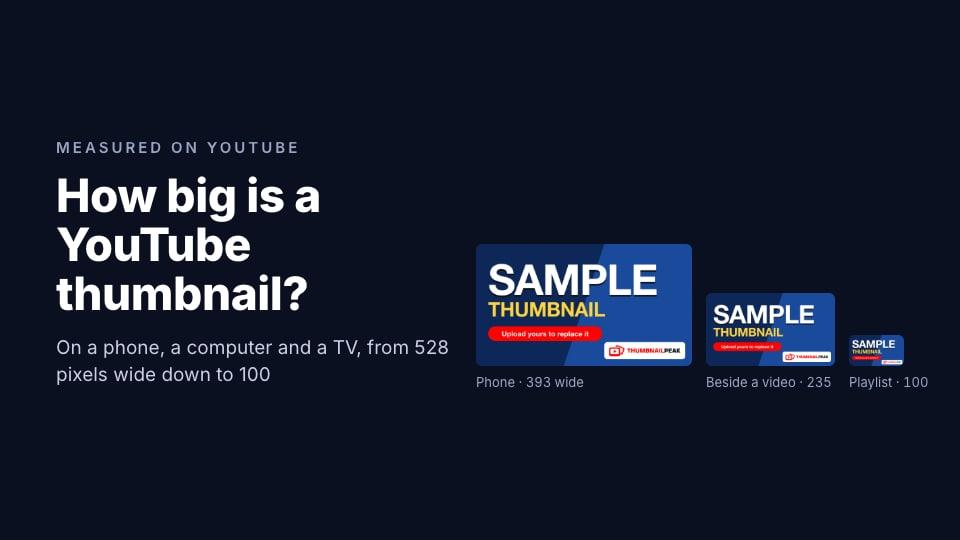
We ran each through ThumbnailPeak's AI critique with the video's real title. We also shrank each to 160×90, the size of a thumbnail on a channel's Videos tab on a phone, and to 100×56, the size in the playlist panel beside a video: the two smallest sizes we found when we measured YouTube. At each size, we asked a machine text reader to read the words back.
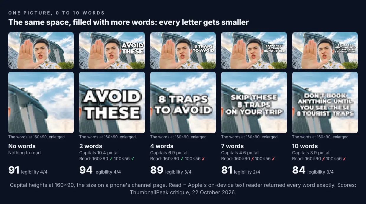
Every extra word shrank every letter. The space didn't change, so a longer headline had to be set smaller to fit. At 160×90, capital letters were 10.4 pixels tall with two words, 6.9 with four, 4.6 with seven and 3.9 with ten.
The machine reader gave up where a person starts to squint. It read two and four words correctly at 160×90. It misread the 7-word headline, taking the "8" for an "&", and turned the 10-word one into "DONE BOOK ANYTHING". At 100×56, it read only the 2-word version correctly, and couldn't find the 7- and 10-word headlines at all. A text reader isn't a person, but it fails where thin strokes blur together, and so do eyes.
The critique followed the same line. The 2-word version scored 94, Exceptional, with the top grade for legibility: "The two-line white headline remains clearly readable at 168×94." The 7-word version scored 81, with legibility down to 2 out of 4: "readable in the full image but becomes very small at 168×94." Its fix was to cut it to "8 TRAPS TO SKIP". For 10 words, it suggested "DON'T BOOK THESE 8".
No words wasn't a failure. The version with no headline scored 91. The hand, the face and the landmark told most of the story. The critique's main fix was to add a short label, "8 TRAPS", because nothing in the picture said how many traps the video covers. Scores move by up to about 5 points between runs, so 91, 94 and 89 are close. 81 and 84 are not.
The words' size matters more than their count
The test above is the worst case: every word sharing one block, all at one size. Real thumbnails rarely work that way, and the 16,199 show it.
Thumbnails with more words didn't make all of them smaller. Their biggest line was just as big: on thumbnails with one or two headline words, the biggest line was 18% of the picture's height, and on those with ten or more, 19%. The extra words went into smaller lines underneath. So the habit of successful thumbnails isn't "few words". It's one line big enough to read in a second, and anything else clearly smaller.
That also fixes the original thumbnail's real problem. DashingHeights' own version, with "AVOID THESE" in red over the hand, scored 80. Its words weren't too many. They were too small, and red on skin: the critique's fixes were to make them bigger and to say the number. Our white, outlined "AVOID THESE", in a bigger space, scored 94.
On ThumbnailPeak, words are one of the most common things the critique asks creators to fix. Of 4,925 thumbnails critiqued from 15 August to 22 October 2026, 23% got a fix to make their words bigger, fewer or shorter, and only 40% got the top grade for legibility.
How to choose your words
- Decide what the picture can't say. A number, a result, a warning, a question. If the picture already says it, leave the words out.
- Don't repeat your title. The title sits right beside the thumbnail. Words that repeat it waste the space: the critique flagged our 10-word version for repeating "8 tourist traps".
- Write one line to be read first, in two to four words. Make it as big as the space allows, and keep it out of the bottom-right corner, where YouTube draws the video's length.
- Put anything else smaller. A second line can be smaller, as long as the first one leads.
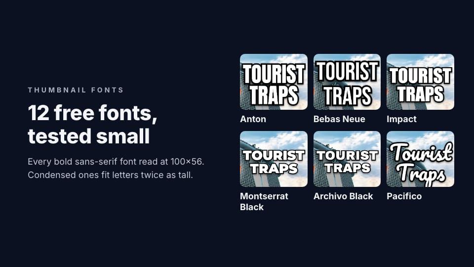
- Use a bold, simple font. Condensed fonts fit longer words in the same space. Our font test set the same two words in 12 fonts.
- Check it at 160 pixels wide. If you can't read a word at the size of a thumbnail on a phone's channel page, cut it or make it bigger. ThumbnailPeak's thumbnail tester shows it on a phone, a computer and a TV, free.
If your thumbnail is already finished and has too many words, you don't need the design file. Edit can change the words on the picture you have. We changed the text on three thumbnails that way.
Frequently asked questions
How many words should be on a YouTube thumbnail?
Most successful thumbnails have one to four headline words; the median across 16,199 recent ones was three. What matters more is that the main line is big enough to read on a phone. In our test, two words were 10 pixels tall at 160×90, and ten words under 4.
Should a YouTube thumbnail have text at all?
It doesn't have to. 24% of the thumbnails we counted had no headline, and the share was highest for pets, animation and film. Add words when they say something the picture can't, such as a number or a result.
How big should the text on a thumbnail be?
On the thumbnails we counted, the biggest line of text was usually about a fifth of the picture's height: a median of 18%, or about 130 pixels on a 1280×720 thumbnail. In our test, a line that size was still readable at 100×56, the smallest size YouTube shows a thumbnail.
Should the thumbnail text repeat the title?
No. The title is right next to it. Use the thumbnail's words for what the title doesn't say.
How we did it: the 16,199 thumbnails come from ThumbnailPeak's Breakouts sample on 22 October 2026, in nine YouTube categories. For each channel with a video published 2 to 20 October at three times or more its usual views, we took that breakout and the channel's four most recent ordinary uploads (0.5 to 1.5 times its usual views), and kept channels whose breakout title is in a Latin-alphabet language. We read each thumbnail at 640×360 with Apple's Vision text recognition, on our own computer, and counted words in lines at least 8% of the picture's height, with the reader at least 50% confident. We checked a random 24 by eye: the reader found every headline. The test thumbnail is DashingHeights' "8 BIGGEST Tourist Traps in Singapore", published under CC BY 3.0; we removed its words and icons with Edit and added our own headlines in Montserrat Black with a black outline, each the largest that fit a 420×560-pixel area. DashingHeights did not make or approve these versions. Each was critiqued once with the video's title on 22 October 2026. The ThumbnailPeak counts cover thumbnails critiqued from 15 August to 22 October 2026, each picture once, with our own account's critiques left out.