Disclosure: we make ThumbnailPeak, and this post uses its Search preview, critique and Edit. Skip The Junk's thumbnail is published under a Creative Commons licence; the blue version is ours, and he didn't make or approve it.
Most advice on thumbnail colours is about what colours mean: red for excitement, blue for trust, yellow for energy. We can't measure what a colour makes someone feel. What we can measure is which colours successful thumbnails use, and what a colour does next to the other videos in a feed.
Here's what we found:
- Breakouts didn't use brighter or bolder colours. Across 3,523 channels, the video that broke out was brighter than the same channel's ordinary thumbnails about as often as it was darker: 49% against 47%. Saturation and colourfulness were coin tosses too.
- Most thumbnails are warm. In 71% of 17,609 recent thumbnails, the strongest colours were red, orange or yellow, which includes skin. Blue led in 17%, green in 6%, and purple or pink in less than 1%.
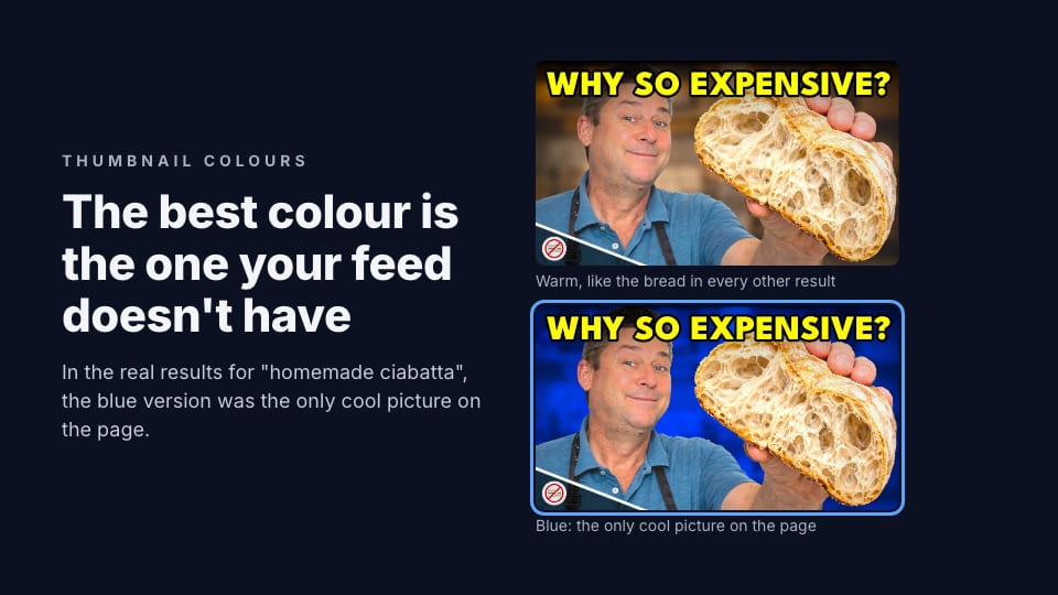
- So the colour that stands out depends on the feed. In YouTube's results for "homemade ciabatta", 21 of 26 thumbnails were mostly bread-coloured and none was more than 3% blue. A blue background made the same thumbnail the only cool picture on the page.
- Contrast is rarely what's wrong. 73% of the 4,925 thumbnails critiqued on ThumbnailPeak got the top grade for contrast, more than any other check.
Breakouts weren't brighter or more colourful
If bright, saturated colours made videos take off, a channel's breakout should be brighter and bolder than its ordinary videos. We checked.
We took ThumbnailPeak's Breakouts sample from 22 October 2026: 3,523 channels with a recent video that got at least three times its usual views. For each, we compared the breakout's thumbnail with four of the channel's ordinary recent videos, the ones that got about its usual views, one pair at a time.
- Brightness: the breakout was brighter in 49% of pairs and darker in 47%.
- Saturation: stronger in 48%, weaker in 49%.
- Colourfulness: more colourful in 48%, less in 50%.
None of those is a difference. A channel's colours are part of its look, and the breakouts kept the look. That fits what we found for words and the overall look: breakouts look like their channel's other videos.
What colours thumbnails actually use
Across all 17,609 thumbnails, we found the strongest, most saturated colours in each and grouped them:
- Warm (red, orange and yellow): 71%. That includes skin, wood, bread, sunsets and the yellow and red of a lot of headline text.
- Blue and cyan: 17%. Science & Technology had the most, at 25%.
- Green: 6%.
- Little strong colour at all: 6%. Black and white, grey, or washed out.
- Purple and pink: under 1%.
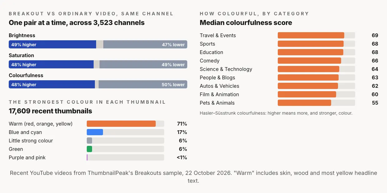
Categories differ in how much colour they use. Travel & Events thumbnails were the most colourful and Pets & Animals the least, with Sports and Education close behind Travel. But in every category, warm colours led, from 64% of thumbnails in Science & Technology to 78% in People & Blogs.
That's the useful fact. If most thumbnails around yours are warm, a warm thumbnail blends in. Which colour stands out isn't a property of the colour. It depends on the videos next to yours.
Stand out from the videos you sit next to
To see what that means in a real feed, we took Skip The Junk's thumbnail for "Homemade Ciabatta That Tastes Better Than the Store!": the creator holding a torn-open loaf, under "WHY SO EXPENSIVE?" in yellow, against a warm, blurred bakery. With ThumbnailPeak's Edit, we made a second version with one change: the background is cobalt blue.
Then we put both into ThumbnailPeak's free Search preview, which searches YouTube for a topic and drops your thumbnails among the real videos that come back, laid out like YouTube's home page. We searched "homemade ciabatta".
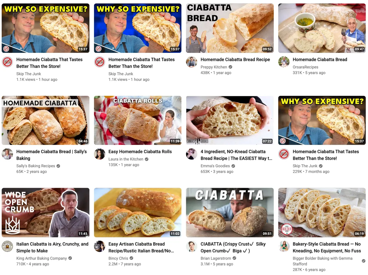
The page is a wall of bread: golden crusts, white crumb, wooden boards. We measured the 26 other thumbnails on it. In 21 of them, warm colours covered at least 30% of the picture. None had more than 3% strong blue. The original thumbnail, warm on warm, is easy to scroll past. The blue one is where your eye lands first.
ThumbnailPeak's AI critique scored the two versions 89 and 90, the same. That's right: on its own, nothing about the thumbnail got better or worse. What changed was its neighbours, and the critique judges one thumbnail at a time. Only a preview among the real videos shows that difference.
A different topic flips it. In a feed of ocean and sky videos, the blue background would blend in and the warm one would stand out. So before you choose a colour, look at what your viewers will see around it.
Contrast is rarely the problem
The other half of colour is contrast inside the thumbnail: the subject against the background, and the words against what's behind them.
Most creators already get this right. Of the 4,925 thumbnails critiqued on ThumbnailPeak from 15 August to 22 October 2026, 73% got the critique's top grade for contrast, more than for any other check. Only 3% got a fix for the contrast of their words. When words don't read, it's far more often because they're too small or too many.
Where contrast does go wrong, it's usually one of three things:
- Coloured words on a similar colour. Red letters on skin, or yellow on a sunset. A dark outline or shadow fixes it.
- A subject the same tone as its background. A grey car on grey tarmac. Brighten or blur the background, or outline the subject.
- Colour doing a job alone. About 1 in 12 men have some red–green colour blindness, so a thumbnail whose idea is a red-to-green change can lose that idea. Our colour blindness guide shows what that looks like and how to fix it.
How to choose your thumbnail's colours
- Search your topic on YouTube first. Look at the colours of the top results. That's the feed your thumbnail has to stand out in.
- Pick a background or accent that isn't there. If the feed is warm, try a cool background. If it's bright, try dark. If everyone uses red arrows, use another colour.
- Keep one or two colours as your own. A consistent accent colour helps subscribers spot your videos. Our branding guide covers how much to keep the same.
- Give the words their own contrast. White or yellow with a dark outline reads on almost anything.
- Check it in the real feed. ThumbnailPeak's Search preview puts your thumbnail among the real results for your topic, and its colour vision picker shows the page the way six kinds of colour-blind viewer see it. It's free and needs no account.
Frequently asked questions
What is the best colour for a YouTube thumbnail?
The one that isn't already in your feed. Most thumbnails are warm, so a cool background often stands out, but in a feed of blue ocean videos, a warm one would. Search your topic first and look at what's there.
Do bright colours get more clicks on YouTube?
We found no sign that brighter or more saturated thumbnails break out. Across 3,523 channels, breakouts were brighter than the same channel's ordinary thumbnails about as often as they were darker.
Does red get more clicks?
Red is already the most common strong colour in thumbnails, along with orange and yellow, so it often blends in. Use it where it contrasts with what's around it, not because it's red.
What colours work for colour-blind viewers?
Avoid putting your idea in a red-versus-green difference alone. Make the difference in brightness too, or add a word or an icon. ThumbnailPeak's Search preview can show your thumbnail the way six kinds of colour-blind viewer see it.
How we did it: the 17,609 thumbnails come from ThumbnailPeak's Breakouts sample on 22 October 2026: for each of 3,523 channels with a video published 2 to 20 October at three times or more its usual views, that breakout and four of the channel's recent ordinary uploads (0.5 to 1.5 times its usual views). Brightness is the average lightness of each thumbnail, saturation its average saturation, and colourfulness the Hasler–Süsstrunk measure, all computed at 320×180 on our own computer. A thumbnail's strongest colour is the hue family with the most strongly saturated pixels. The ciabatta thumbnail is Skip The Junk's, published under CC BY 3.0; we changed its background with ThumbnailPeak's Edit. The other thumbnails in the search results belong to their creators and appear for commentary. Both versions were critiqued once with the video's title, and the search was run in ThumbnailPeak's Search preview, on 22 October 2026. "Warm" in the feed means hues from orange to yellow at moderate saturation; "strong blue" means saturated blue. The ThumbnailPeak counts cover thumbnails critiqued from 15 August to 22 October 2026, each picture once, with our own account's critiques left out.