Three tiers, two of them identical
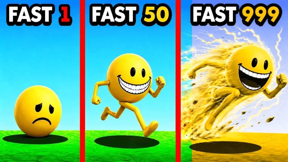
Here is a thumbnail doing everything right. It is from ProjectJamesify's "Upgrading FASTEST VERITY", and it splits into three panels showing the same character at three levels of speed. The numbers are color-coded to match: the 1 is red, the 50 is gold, the 999 is green. You do not have to read the panels in order or think about what they mean. The color does the work — red is the sad starting point, green is the payoff.
That is good design. It is also the exact part that disappears for a large slice of the audience.
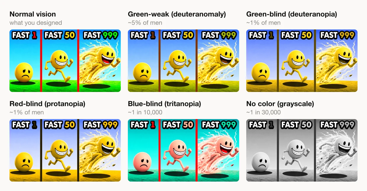
Look at the red-blind (protanopia) panel. The "50" is gold. The "999" is gold. Not similar — the same. A three-step escalation has quietly become a two-step one, and the top tier, the whole reward the thumbnail is selling, no longer looks like an upgrade over the middle tier at all.
This is not a rounding error
Color-vision deficiency is one of the most common inherited conditions there is. It affects roughly 8% of men — about 1 in 12 — and roughly 1 in 200 women, because the genes for the red and green cones sit on the X chromosome.
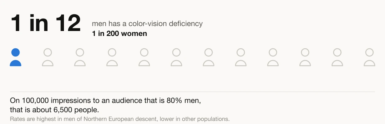
Put that on the scale a thumbnail actually operates at. A video that earns 100,000 impressions from a gaming audience — which typically skews around 80% male — is showing that image to something like 6,500 people who will not see the colors you picked. They are not a fringe. They are, on a single mid-sized video, a stadium's worth of viewers, and they are making the same half-second click decision as everyone else with less information than you intended to give them.
The pair that breaks is not the pair you would guess
"Red-green color blind" invites an obvious conclusion: keep red away from green. But that folk model gets this thumbnail exactly backwards.
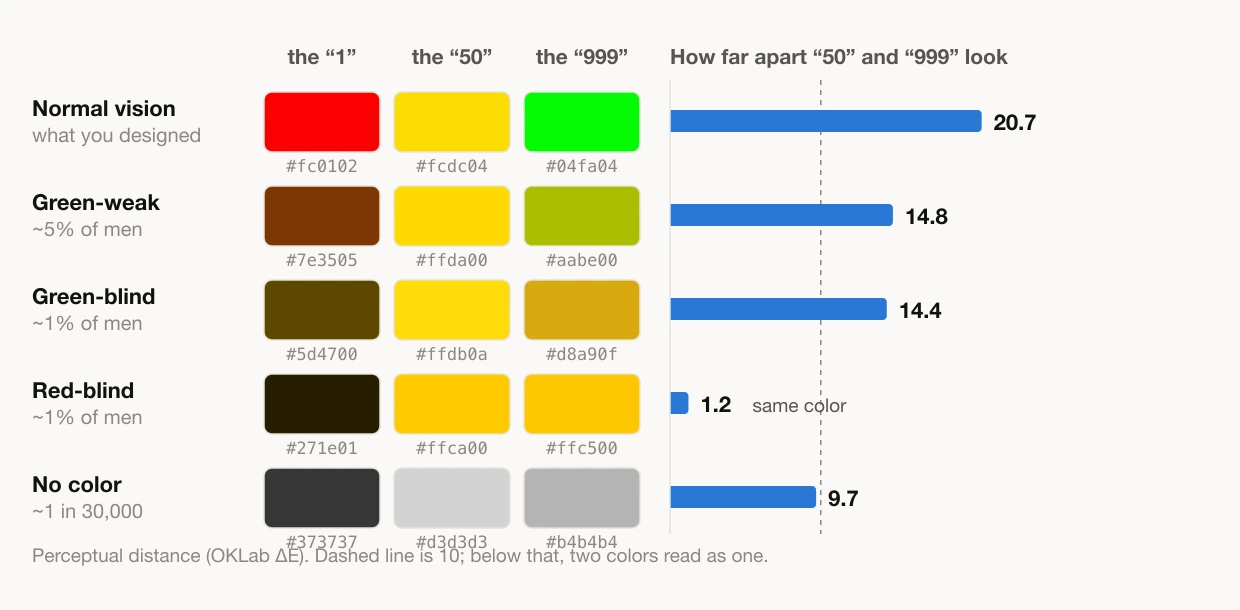
Those are the real pixel colors sampled from the image — #fc0102, #fcdc04, #04fa04 — pushed through the same simulation the browser uses, with the perceptual gap between the gold and the green measured on each row.
The red never fails. Under red-blind vision it darkens to near-black, which puts it further from the other two than it started. The pair that collapses is gold and green, and it collapses completely: a perceptual distance of 20.7 in normal vision falls to 1.2, which is not "hard to tell apart" but "the same color." The designer's instinct to keep the dangerous red away from the green was never the issue. The two colors nobody worries about are the two that merge.
The reason is in the bottom row. Strip the color out entirely and the gold and the green are still nearly identical — 9.7 apart, because their relative luminance is 0.719 and 0.684. They are the same brightness. Hue was the only thing separating them, so when hue went, nothing was left holding them apart. The red survives precisely because it was much darker all along.
That is the rule underneath all of this, and it is worth more than any list of colors to avoid:
If two things in your thumbnail must read as different, make sure they differ in lightness, not only in hue.
The one-second test
You do not need to memorize prevalence rates to apply that. Turn the color off.
Grayscale is the last mode in the picker, and almost nobody literally sees that way — total color blindness is around 1 in 30,000. It earns its place for a different reason: it is the fastest possible check for whether your design is leaning on hue alone. If two elements are still clearly different in grayscale, they will survive every color-vision deficiency there is, because none of them touch lightness. If they merge in grayscale, you have found a real risk before you have had to think about which specific deficiency causes it.
Fixing it without dulling your thumbnail
The advice creators usually get is to avoid saturated red and green — which is useless, because saturated color is doing a job on a thumbnail. You cannot pastel your way to a higher CTR.
There are two fixes that keep the punch, and we can check both instead of guessing:
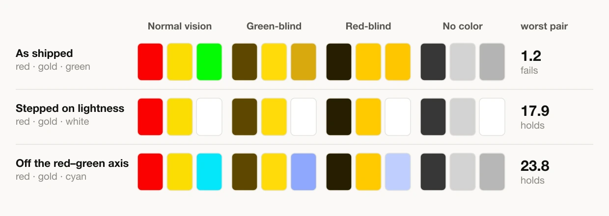
Step the tiers on lightness. Keep red and gold, and make the top tier white instead of green. Nothing is desaturated, the escalation now runs dark → bright, and the worst pair across every deficiency goes from 1.2 to 17.9. Brightness is a channel no color-vision deficiency takes away.
Or move off the red–green axis. Swap the green for cyan. Deuteranomaly, deuteranopia and protanopia all affect the red-green axis and leave blue-yellow essentially intact, so cyan against gold stays wide open — a worst pair of 23.8, the strongest of the three. It scores the same on the grayscale row as the original did, which is exactly why the verdict here is measured across the four actual deficiencies rather than on the grayscale shortcut.
And a third option that needs no repainting at all: add a cue that is not color. Make the top tier bigger, give it an outline, put a crown on it. Color-coding is fine as long as color is not the only copy of the message.
Try it on your own thumbnail
ThumbnailPeak has a color-vision picker on every preview surface — the feed preview, the search results mock, the channel page preview and the competitor preview. Upload your thumbnail, open the picker, and step through six options: normal vision, green-weak (deuteranomaly), green-blind (deuteranopia), red-blind (protanopia), blue-blind (tritanopia), and no color at all.
Two details worth knowing about it. First, it simulates the common case and not only the severe one. Deuteranomaly — green-weak — is about 5% of men on its own, an order of magnitude more common than full deuteranopia, and it compresses the red-green axis rather than collapsing it. Simulating only the severe end would have told you your thumbnail was broken for a group it mostly works for.
Second, the whole mock is filtered, YouTube's chrome included, and the numbers are the real thing: the coefficients come from Machado, Oliveira & Fernandes (2009), the same table Chromium uses for DevTools' "Emulate vision deficiencies." Chrome's version is developer-only and cannot be switched on from a page, so the matrices live in the app — but if you check our answer against the browser's, you will get the same picture.
What to take away
- 1 in 12 men and 1 in 200 women see your colors differently. On a mid-sized video that is thousands of people per upload.
- Lightness is the channel that always survives. Hue is not. If two elements only differ in hue, they only differ for some of your audience.
- Check gold against green, not just red against green. The pair you would never suspect is the one that merged to a perceptual distance of 1.2 here.
- Grayscale is the one-second test. If it still reads with the color off, it reads for everyone.
- You do not have to mute anything. Step the lightness or move to the blue-yellow axis, and the thumbnail keeps every bit of its punch.
None of this is about designing for a minority at the expense of everyone else. A thumbnail that survives the grayscale test is a thumbnail with strong luminance contrast — and that is the same property that makes it readable at 168×94 in the sidebar, on a dim screen, in sunlight, at a glance. Designing so the color-blind viewer can read it is mostly just designing well. Run yours through the preview and see which mode, if any, takes the point out of it.